Overview
The purpose of this article is to help you understand the metrics in Sales Spotlight and know how to use them effectively. In this article we take a deep dive into each metric; definition, calculation, usage, and where to find each metric in Trella Insights and in Trella CRM.
To jump directly to a list of specific metrics in this article - ![]()
 Let's get Oriented
Sales Spotlight comes in four flavors and the differences between the flavors is where you will find each version and the metrics available in each.
-
Sales Spotlight In Trella Insights -
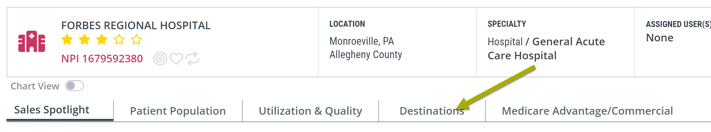
 - on Physician or Facility Analyze pages, Sales Spotlight is the content in the first tab.
 -
Sales Spotlight Email -
 - on Physician or Facility Analyze pages, under the Sales Spotlight tab, you can send yourself or any of your colleagues the Sales Spotlight email. Look for this button
-
Sales Spotlight In Trella CRM -
 - click on the "Market Spotlight" button in the left navigation to open the Market Spotlight page, then for any physician or facility, when you click on the provider's name, Sales Spotlight will open.
 - Conversation Starters - In the case of both Sales Spotlight in Trella Insights and Sales Spotlight in Trella CRM, there is a "view" of the content called Conversation Starters. The metrics in Conversation Starters are different in that they are presented in a sentence that compares two metrics. The metrics in the Sales Spotlight email are all presented in this sentence format.
Signposts in this article
So that you can quickly determine which metric is included in which version of Sales Spotlight, at the top of the section where each metric is described below, we will display the following icons:
![]() - For metrics included in Sales Spotlight in Trella Insights
- For metrics included in Sales Spotlight in Trella Insights
![]() - For metrics included in the Sales Spotlight email (SSEmail)
- For metrics included in the Sales Spotlight email (SSEmail)
![]() - For metrics found in Sales Spotlight in Trella CRM
- For metrics found in Sales Spotlight in Trella CRM
![]() Relevant details about Conversation Starters will be included under each metric in which they appear.
Relevant details about Conversation Starters will be included under each metric in which they appear.
 In this article
Content summary
This article contains the definition, calculation and usage information for each metric tile in the Sales Spotlight tab. You can certainly browse the entire article, or, you can use the following list of metrics in order to find a specific metric of interest and navigate to that section of the article using the link.
Sales Spotlight and the Sales Spotlight email have two sections of metrics:
- Get to Know this Hospital - metrics that help you to evaluate the selected hospital.
- How do I Stand Out? - metrics that help you to create a story about your chosen "My Agency."
![]() Click on the metric name to immediately navigate to the details for that metric.
Click on the metric name to immediately navigate to the details for that metric.
-
Get to Know this Hospital
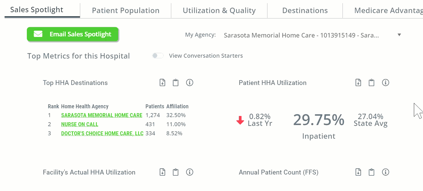
- Patient Volume (Only Sales Spotlight email) - two metrics - Medicare FFS patients and HHA Patients counts
- Top HHA Destinations - the home health agencies with the highest count and percentage of patients who were admitted to home care within 30 days of discharge from the selected hospital during the one-year reporting period
- CMS Payer Mix - 20XX - This tile has the most recent possible comparison metrics for patient counts for the selected provider in the same year for Medicare Fee for Service, Medicare Advantage, and Medicaid. Since MA metrics are not released by CMS for about two years, this comparison is two years old
- Patient HHA Utilization - Percentage of facility discharges during the one-year reporting period that resumed or started a new home health stay within 30 days of discharge
- Facility's Intended HHA Utilization - Percentage of facility discharges that were coded for home health services during the one-year reporting period
- Facility's Actual HHA Utilization - Percentage of facility discharges that were coded for home health services and resumed or started a new HH stay within 30 days of discharge during the one-year reporting period
- Annual Patient Count (FFS) - Count of distinct Medicare FFS patients discharged from the selected hospital during the one-year reporting period, by claim type
- Readmission Rate: 30-Day - percentage of patients readmitted into any hospital within 30 days of their discharge from the selected inpatient facility during the two-year reporting period
- Patient Risk Score- Average Hierarchical Condition Category (HCC) Patient Risk Score for this facility (based on claim type).
- Highest Readmission Rate MS-DRGs - List of MS-DRGs associated with the highest 30-day readmission rates for the selected hospital.
- Patient Locations - CRM Only* - The top five counties where patients treated by the selected hospital reside
- Chronic Conditions - CRM Only* - The top five diagnoses for patients treated by the selected hospital
- Trella Diagnostic Group - CRM Only* - The top five Trella Health Diagnostic categories for patients treated by the selected hospital
-
How Do I Stand Out?
- Total Patient Cost Following HHA (12-month Risk-Adjusted) - Average total risk-adjusted Medicare spend per patient during the 12 month follow-up period after admission to the selected HHA
- HHA Hospitalization Rate: SOC to 30 days - Average total risk-adjusted Medicare spend per patient during the 6 month follow-up period after admission to the selected HHA
- HHA Readmission Rate: 30-Day - percentage of the selected facility's patients who were discharged from an inpatient setting, were admitted to the listed home health agency, and were subsequently readmitted to any hospital within 30 days of the first inpatient discharge (based on 2-years of discharges, shifted back 30 days)
- HHA Average Length of Stay - Average number of days spent in the selected HHA for patients with the listed MS-DRG
![]() Even more details
Even more details
- Some of these metrics include trend information and county or state benchmarks.
- The tables identified as "CRM Only" in the menu above are summaries of complete tables that can be found in Trella Insights on the Analyze page for the selected provider under other tabs.
Get to Know this Hospital
 Evaluate
This section of Sales Spotlight or the Sales Spotlight email includes the most helpful and insightful metrics you can use to evaluate the selected provider.
Patient Volume
| Sales Spotlight on Analyze Page | Sales Spotlight Email | Sales Spotlight in Trella CRM |
| The metrics in Patient Volume are presented as Annual Patient Count |  |
The metrics in Patient Volume are presented as Annual Patient Count |
![]() Even though the way the definition is written suggests that the "hospital treated 626 home health patients" this should not be understood to mean that the hospital provided home health services. The correct meaning is that 626 patients discharged from the hospital were admitted to home health agencies for home care services.
Even though the way the definition is written suggests that the "hospital treated 626 home health patients" this should not be understood to mean that the hospital provided home health services. The correct meaning is that 626 patients discharged from the hospital were admitted to home health agencies for home care services.
 Usage
Usage
![]() Evaluate the hospital - Patient counts are always an insight into referral potential. A larger number of patients implies a greater number of possible referrals. A large number of home health patients, since it is a count of patients who were admitted to home care, pinpoints even more precisely the potential for home health referrals.
Evaluate the hospital - Patient counts are always an insight into referral potential. A larger number of patients implies a greater number of possible referrals. A large number of home health patients, since it is a count of patients who were admitted to home care, pinpoints even more precisely the potential for home health referrals.
 Connections
Although counts of patients are helpful in identifying referral potential in a general way, further evaluation of the hospital is helpful. The following tables and metrics will help you to further assess referral potential and will also suggest next steps.
- On the Analyze page for the selected hospital, under the Destinations tab, the table FFS Home Health Destinations contains the list of home health agencies that admitted patients discharged from the hospital. There are two insights that will help you to evaluate the potential and your ongoing course of action.
- Competitive position - The table will show you the count of patients admitted to your agency during the reporting period, as well as the names of your competitors and the count of patients admitted to those agencies. You can quickly identify where your agency fits in the mix of agencies treating patients from the selected hospital.
- Distribution - There are two things to look for. 1) Look for a single agency that is treating a massive majority of the home health patients for the selected hospital. If it is your agency, then you know that your task is account maintenance - good job! If the top agency is a competitor, then you are facing the hard choice of competing with a preferred agency or moving on to a different hospital. 2) If there are a large number of different agencies treating patients from the selected hospital, this spread could indicate a lack of direction from the discharge planning team at the hospital. Developing a partnership with the hospital can potentially funnel those patients to your agency.
- On the Analyze page for the selected hospital, under the Patient Population tab, there are a number of tables that will allow you to assess demographics of the hospital's discharged patients to identify alignment with your areas of expertise and location.
 Definition
The email statement includes two metrics.
- Home Health Patients - This number is the count of distinct Medicare FFS patients treated at the selected hospital during the one-year reporting period who were admitted to home health services within 30 days of discharge from inpatient care.
- Medicare FFS Patients - This metric is the count of distinct Medicare FFS patients discharged from inpatient care at the selected hospital during the one-year reporting period.
![]() These two counts are based on discharges from inpatient care only. The hospital most likely had a larger number of outpatient claims, but those are not included in these counts.
These two counts are based on discharges from inpatient care only. The hospital most likely had a larger number of outpatient claims, but those are not included in these counts.
 Calculation
These metrics are simple counts of distinct patients for which the above parameters apply.
 Where can I find these metrics?
In addition to the Hospital Sales Spotlight email, you can find these metrics:
Trella Insights
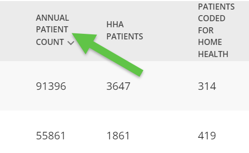
- On the Facility Explore page; Home Health Patients is called HHA Patients, and Medicare FFS Patients is called, Annual Patient Count (FFS)
- On the Analyze Page for the selected hospital, under the Patient Population tab. there is a table called Patient Volume. These two metrics are in different rows under the header Annual Patient Counts (FFS). Medicare FFS Patients is called Distinct Patients in this table.
Trella CRM
- The Annual Patient count metric is visible on the Market Spotlight page
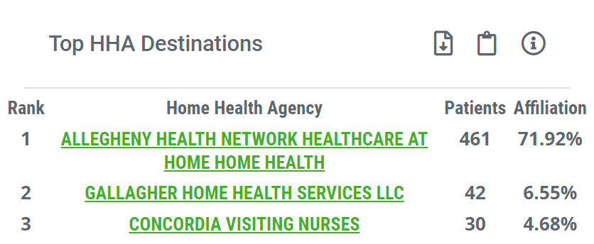
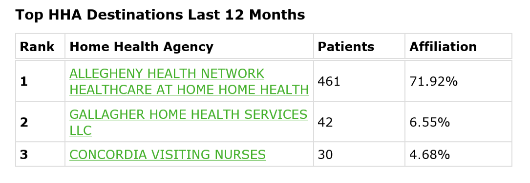
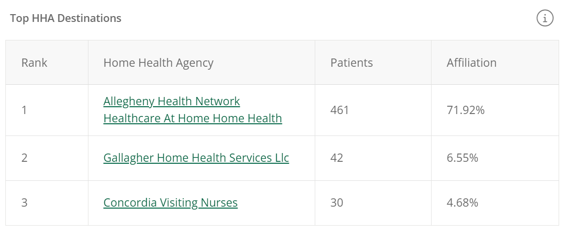
Top HHA Destinations
| Sales Spotlight on Analyze Page | Sales Spotlight Email | Sales Spotlight in Trella CRM |
 |
 |
 |
Using this metric
![]() Compare
Compare
At a glance you can see if your agency is in the top three agencies that admitted patients to home care who were discharged from the selected hospital. If your agency is not in the top three, the insight you will gain is to know which of your competitors admitted the most patients from the selected hospital.
Connections
This Sales Spotlight Top HHA Destinations tile only lists the top three home health agencies. To see the full spread of destinations (Trella Insights for Home Health only), click on the Destinations tab to view the FFS Home Health Destinations table to view all home health destinations for the selected hospital.
 Understanding the Metric
Definition
This table lists the three agencies that admitted the highest count and percentage of patients discharged from the selected hospital.
 Details
The table includes four details for each listed home health agency:
- Rank - The number that identifies the hierarchy of each agency based on patient count
- Home Health Agency - The name of the home health agency. The name is a link to the Analyze page for the listed agency.
- Patients - The count of distinct patients discharged from the selected hospital who were admitted to the listed agency within 30 days of discharge for the one-year reporting period.
- Affiliation - the percentage of discharges from the selected hospital who were admitted to the listed home health agency.
Conversation Starters - With Conversation Starters on you will see the same content described in a sentence format.
Where can I find these metric?
In addition to the Hospital Sales Spotlight on the Analyze page, you can find these metrics:
Trella Insights
- On the Analyze page for the selected hospital, under the Destinations tab, the complete list of home health destinations can be found in the table Home Health Destinations.
Trella CRM
- Trella CRM does not have any additional destinations content.
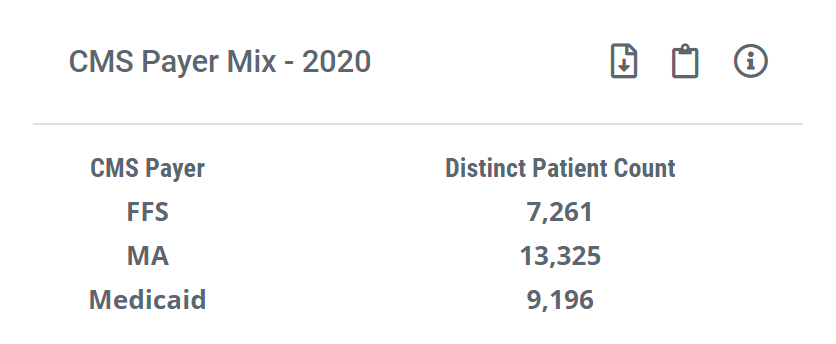
CMS Payer Mix - 20XX
| Sales Spotlight on Analyze Page | Sales Spotlight Email | Sales Spotlight in Trella CRM |
 |
The content for this tile is not included in the Sales Spotlight email | The content for this tile is not included in the Sales Spotlight for CRM |
Using this metric
![]() Evaluate
Evaluate
This tile allows you to view the payer mix for a physician or hospital at-a-glance in Sales Spotlight so you can identify whether they are a good fit for your organization. For example, if you want to target FFS patients, you can qualify a referral source by viewing their payer mix here.
![]() Compare
Compare
The included metrics allow you to compare patient counts for the selected hospital for these three payer types:
- FFS - Medicare Fee for Service
- MA - Medicare Advantage
- Medicaid
![]() In order to provide a meaningful comparison between the three different payer types, we display counts from the most recent year for which all three payers have complete counts available. CMS releases complete Medicare Advantage data two years after the reporting quarter is closed. We make counts for Medicare FFS and Medicaid for the same period to provide a meaningful comparison.
In order to provide a meaningful comparison between the three different payer types, we display counts from the most recent year for which all three payers have complete counts available. CMS releases complete Medicare Advantage data two years after the reporting quarter is closed. We make counts for Medicare FFS and Medicaid for the same period to provide a meaningful comparison.
Understanding the Metrics
![]() Definition
Definition
The three metrics displayed are counts of distinct patients treated by the selected hospital during the one year reporting period based on claims for each claim type.
![]() Where can I find these metrics?
Where can I find these metrics?
These metrics are not displayed anywhere else in Trella Insights for Home Health nor in Trella CRM. They only apply to the selected hospital and are placed in Sales Spotlight to contribute to an evaluation of the hospital as a source of referrals.
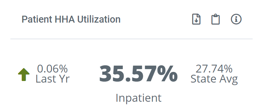
Patient HHA Utilization
| Sales Spotlight on Analyze Page | Sales Spotlight Email | Sales Spotlight in Trella CRM |
 |
 |
 |
![]() With Conversation Starters on in either Trella Insights for Home Health or Trella CRM, this tile will be the same as what is displayed above for the Sales Spotlight Email. The metric for the selected hospital is compared to a benchmark or competitor in a sentence.
With Conversation Starters on in either Trella Insights for Home Health or Trella CRM, this tile will be the same as what is displayed above for the Sales Spotlight Email. The metric for the selected hospital is compared to a benchmark or competitor in a sentence.
Using this metric
![]() Evaluate
Evaluate
You can quickly see whether the selected hospital has a higher or lower percentage of patients being admitted to home health care when compared to the state.
Understanding the Metric
Definition
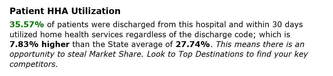
Utilization is the percentage of hospital discharges during the one-year reporting period who resumed home health care or started a new home health stay within 30 days of discharge.
Calculation
We divide the count of discharges admitted to home health care within 30 days of D/C by the count of all discharges from the selected hospital, thus:

Details
The insight includes three elements:
- In the center is the core metric. Beneath the metric is a reminder that the Utilization metric is calculated using only inpatient discharges from the selected hospital.
- On the left is a trend indicator. The
 indicates that the selected hospital's home health utilization is up 0.06% over the previous one-year metric. The arrow is green to indicate that an increase year over year is a good trend. If the trend had been down, the percentage decrease would have been indicated by a red arrow, pointing down.
- On the right is the state average of home health utilization for all hospitals in the same state as the selected hospital.
Where can I find this metric?
Trella Insights
- In Trella Insights 4 Home Health, on the Analyze page for the selected hospital, under the Utilization and Quality tab, there is a table called Home Health Utilization that shows trended utilization metrics.
Trella CRM
- This metric is not found anywhere else in Trella CRM.
Facility's Intended HHA Utilization
| Sales Spotlight on Analyze Page | Sales Spotlight Email | Sales Spotlight in Trella CRM |
 |
 |
 |
Definition
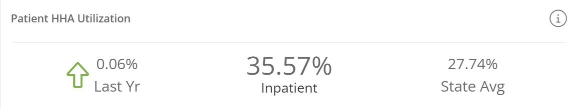
In Trella Insights, when we speak of "Intended Utilization," we are making reference to status coding on the discharge claim for a specific type of care subsequent to discharge. In this case, the "Intention" at discharge was that the patient to home health care.
![]() For more information, see How does Trella Health Identify Discharge Status Coding?
For more information, see How does Trella Health Identify Discharge Status Coding?
This metric is the percentage of facility discharges from the selected facility that were coded for home health services at discharge during the one-year reporting period.
Calculation
This metric is the percentage of all discharges that were coded at discharge to receive home health care.

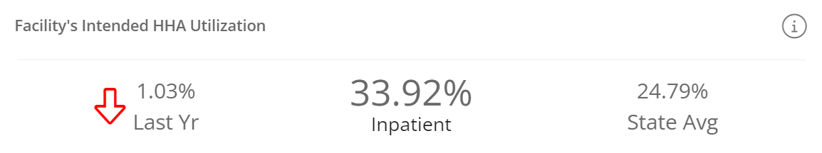
Details
The insight includes three elements:
- In the center is the core metric. Beneath the metric is a reminder that the metric is calculated using only inpatient discharges from the selected hospital.
- On the left is a trend indicator. The indicates that the selected hospital's home health Intended Utilization is down 1.03% over the previous one-year metric. The arrow is red to indicate that an decrease year over year is an unfavorable trend. If the trend had been up, the percentage increase would have been indicated by a green arrow, pointing up.
- On the right is the state average of home health Intended utilization for all hospitals in the same state as the selected hospital.
Where can I find this metric?
In addition to the Hospital Sales Spotlight on the Analyze page, you can find these metrics:
- On the Analyze page, under the Utilization and Quality tab, there is a table called Home Health Utilization that shows trended intended utilization metrics.
Trella CRM
- This metric is not found anywhere else in Trella CRM. Although Market Spotlight does give a count of patients coded for home health which could be used with other metrics in the table to calculate a similar metric.
Facility's Actual HHA Utilization
| Sales Spotlight on Analyze Page | Sales Spotlight Email | Sales Spotlight in Trella CRM |
 |
|
 |
Definition
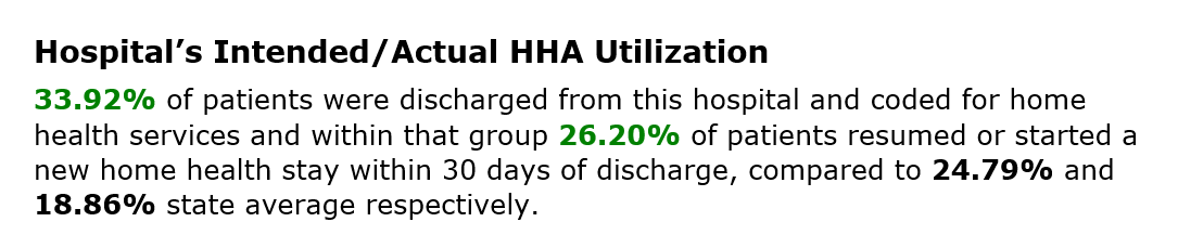
In Trella Insights, when we speak of "Actual Utilization," we are making reference to patients who were discharged from the selected hospital, coded for home health care, and admitted to home health care within 30 days. Think of it this way; this metric is the percentage of patients who successfully followed their discharge instructions.
The "official" definition for this metric is nuanced as the percentage of facility discharges that were coded for home health services and resumed or started a new HH stay within 30 days of discharge during the one-year reporting period.
Calculation
Divide the count of patients discharged from the hospital who were coded for home health who were admitted to home health within 30 days by the count of discharges from the selected hospital.

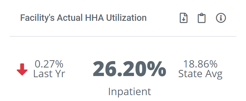
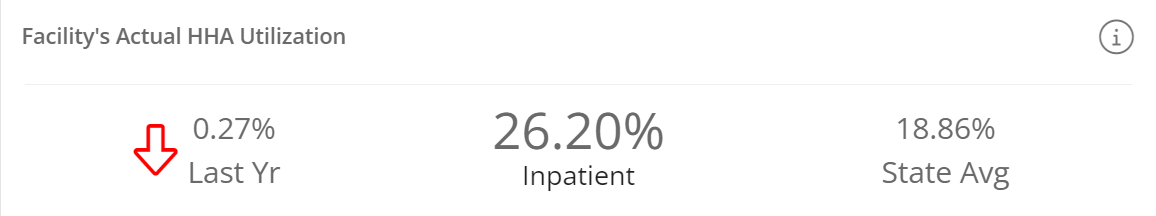
Details
The insight includes three elements:
- In the center is the core metric. Beneath the metric is a reminder that the Utilization metric is calculated using only inpatient discharges from the selected hospital.
- On the left is a trend indicator. The indicates that the selected hospital's home health Actual Utilization is down 0.27% over the previous one-year metric. The arrow is redto indicate that an decrease year over year is an unfavorable trend. If the trend had been up, the percentage increase would have been indicated by a green arrow, pointing up.
- On the right is the state average of home health actual utilization for all hospitals in the same state as the selected hospital.
Where can I find this metric?
In addition to the Hospital Sales Spotlight on the Analyze page, you can find these metrics:
Trella Insights
- On the Analyze page, under the Utilization and Quality tab, there is a table called Home Health Utilization that shows trended actual utilization metrics.
Trella CRM
- This metric is not found anywhere else in Trella CRM.
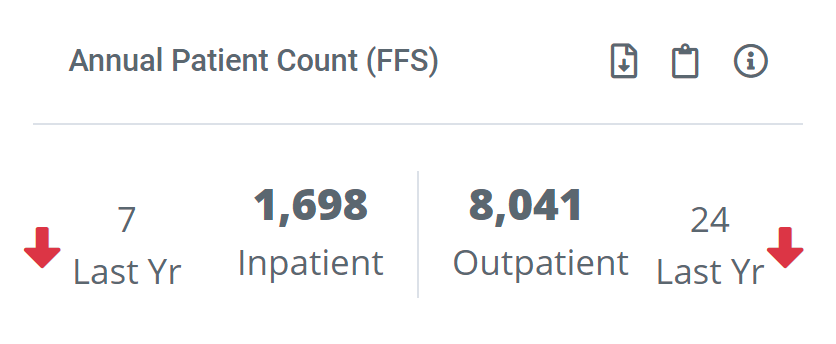
Annual Patient Count (FFS)
| Sales Spotlight on Analyze Page | Sales Spotlight Email | Sales Spotlight in Trella CRM |
 |
You will find this metric in the email under Patient Volume | 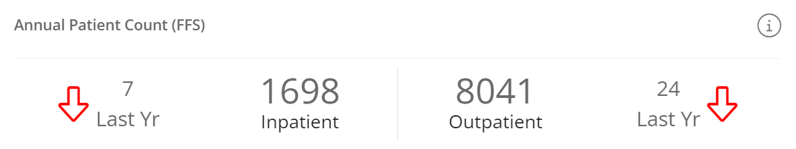 |
Understanding the Metric
Definition
Each of these metrics is a count of distinct patients for the one-year reporting period.
- Inpatient count - The count of distinct patients discharged from the selected facility during the one-year period who had been admitted to inpatient care.
- Outpatient count - The count of distinct patients for whom an outpatient claim was submitted during the one-year reporting period.
- Home Health patients count - (with Conversation Starters on) - This is a count of the distinct patients discharged from the selected facility who were admitted to home health care during the one-year reporting period.
Details
With Conversation Starters off, counts of distinct inpatient and outpatient patients are displayed. To the out-side of the main metrics the differences between the count for the current data set and the count for the previous year are displayed. An arrow shows whether the more recent patient count is higher ![]() or lower
or lower ![]() than the prior year.
than the prior year.
With Conversation Starters on, the count of home health patients and the count of distinct Medicare FFS patients are presented in a sentence format.
Where can I find this metric?
In addition to the Hospital Sales Spotlight on the Analyze page, you can find these metrics:
Trella Insights
- In Trella Insights for Home HealthOn the Analyze page for the selected facility, under the Patient Population tab, the Annual Patient Count (FFS) metric can be found in the table, Patient Volume.
- On the Facility Explore page - and remember that hospitals tend to show up in two different rows with metrics for inpatient stays and outpatient services.
Trella CRM
- In Trella CRM, under the Market Spotlight tab, in the row for the selected hospital, there is a column for Annual Patient Count.
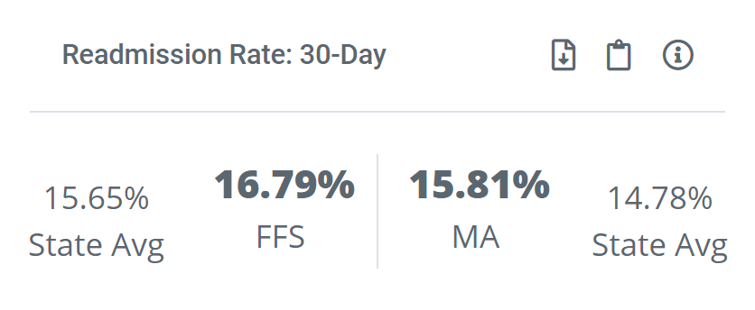
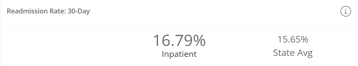
Readmission Rate: 30-Day
| Sales Spotlight on Analyze Page | Sales Spotlight Email | Sales Spotlight in Trella CRM |
 |
 |
 |
Using this metric
![]() Evaluate
Evaluate
Hospitals are penalized for high readmission rates. If you can show a hospital that your agency has a history of care that keeps readmission rates down, you are more likely to receive patient referrals from that hospital.
Definition
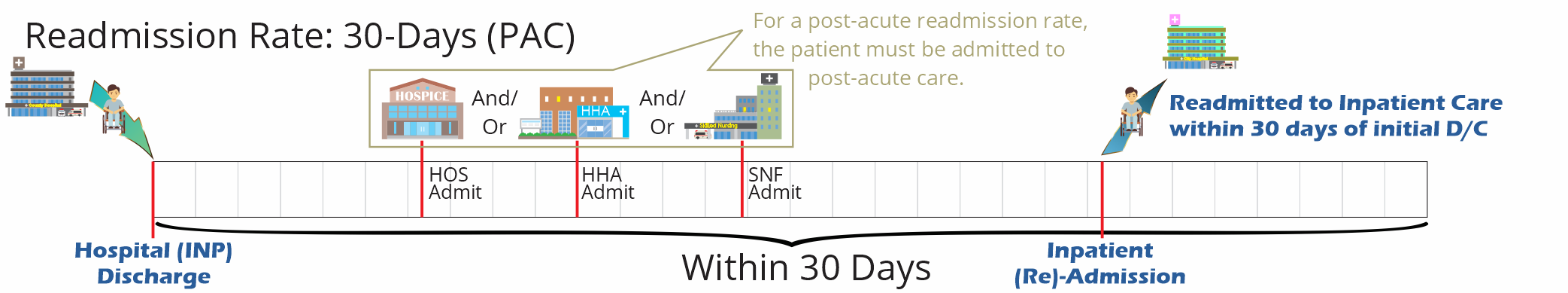
A readmission is a care event where a patient is admitted to any inpatient stay within 30 days of being discharged from a previous inpatient stay.
Like this: INP D/C ![]() INP (RE)Admission within 30 days.
INP (RE)Admission within 30 days.
The Readmission Rate in this Sales Spotlight Insight is the percentage of patients discharged from the selected hospital who were readmitted to inpatient care within 30 days of the initial discharge.
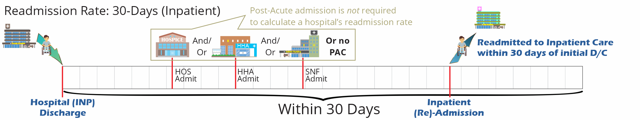
![]() Inpatient readmissions only apply to a selected hospital. Whether any post-acute care occurred between discharge and readmission is not considered for this metric.
Inpatient readmissions only apply to a selected hospital. Whether any post-acute care occurred between discharge and readmission is not considered for this metric.
Calculation
The readmission rate for the selected hospital is calculated in this way:

![]() Although the equation above is simple, there are lots of potential qualifications, restrictions and inclusions involved in calculating readmission rates in the Trella Insights platform. For more information, see Readmission Rates.
Although the equation above is simple, there are lots of potential qualifications, restrictions and inclusions involved in calculating readmission rates in the Trella Insights platform. For more information, see Readmission Rates.
Details
- Readmission rates are provided for Medicare FFS patients and for Medicare Advantage patients.
- Along with the readmission rate for the selected hospital, we provide the state averages for comparison.
- With Conversation Starters on, we present the comparison between the selected hospital and the state or county average in a sentence.
Where can I find this metric?
In addition to the Hospital Sales Spotlight on the Analyze page, you can find these metrics:
Trella Insights
- The readmission rate for the selected hospital can be found on the Explore page. The metric on the Explore page is rounded to the nearest whole number.
Trella CRM
- This metric is not found anywhere else in Trella CRM.
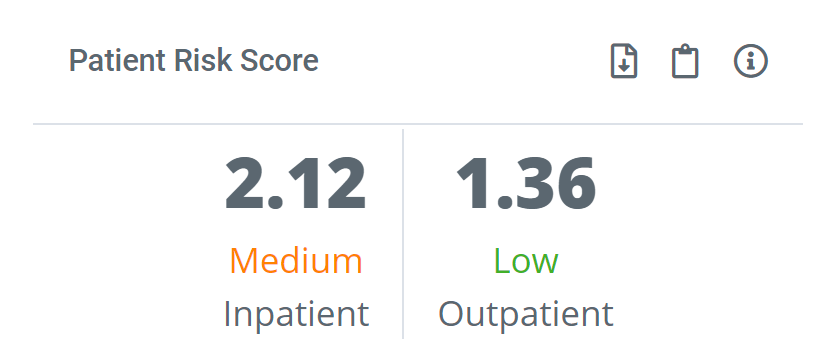
Patient Risk Score
| Sales Spotlight on Analyze Page | Sales Spotlight Email | Sales Spotlight in Trella CRM |
 |
Risk Scores for the selected hospital are not included in the SS Email | 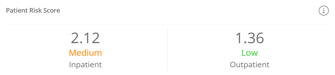 |
Understanding the Metric
Definition
Risk Scores provide insight into the amount of care that can be expected for the patient population treated by the listed provider, and it helps calibrate a provider’s performance relative to its peers.
![]() For more information, see Risk Scores and HCC.
For more information, see Risk Scores and HCC.
Where can I find this metric?
In addition to the Hospital Sales Spotlight on the Analyze page, you can find this metric:
Trella Insights
- On the Explore page in the row for the selected hospital.
Trella CRM
- This metric is not found anywhere else in Trella CRM.
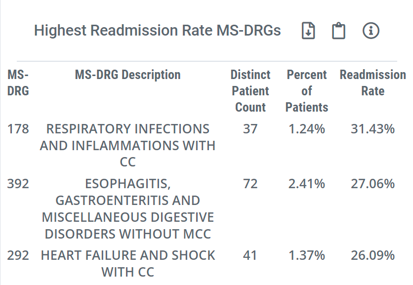
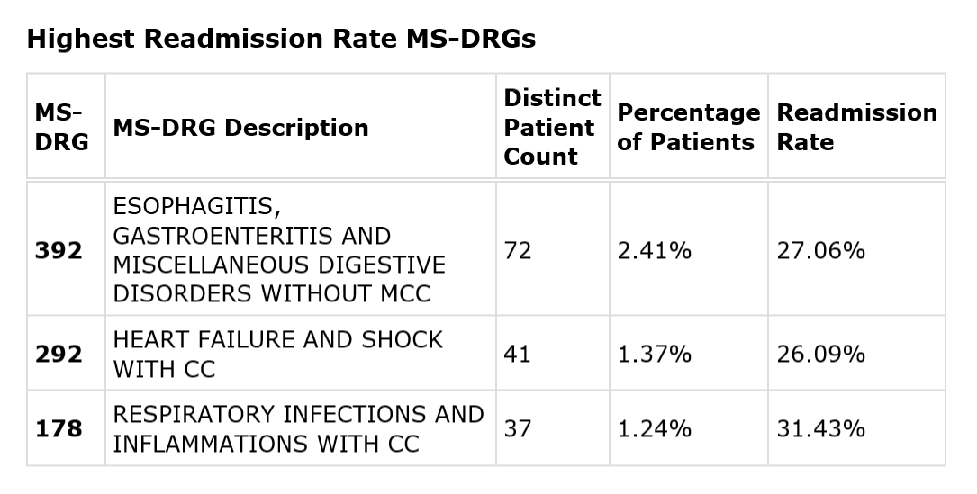
Highest Readmission Rate MS-DRGs
| Sales Spotlight on Analyze Page | Sales Spotlight Email | Sales Spotlight in Trella CRM |
 |
 |
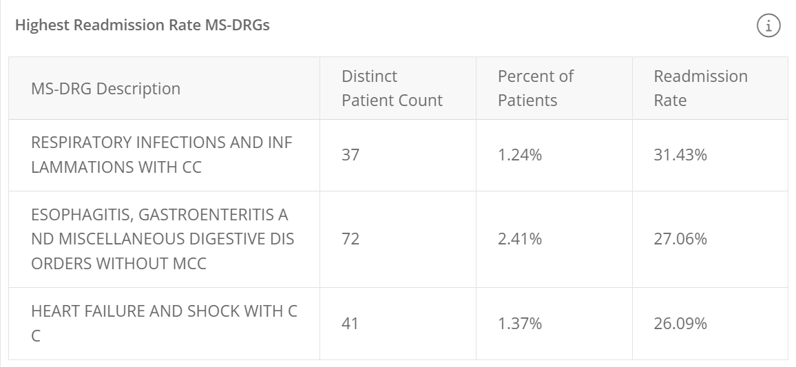 |
Definition
This insight contains the three MS-DRGs associated with the highest 30-day readmission rates for the selected hospital.
This insight includes the following:
- MS-DRG - The three digit code for the DRG
- MS-DRG Description - The name/description of the MS-DRG
- Distinct Patient Count - The count of patients discharged from the selected hospital where the listed MS-DRG was the primary diagnosis on the claim.
- Percentage of patients - The percentage of discharged patients for whom the listed DRG was their primary diagnosis (See calculation)
- Readmission Rate - The percentage of discharged patients for the listed DRG who were readmitted to inpatient care within 30 days of discharge from the selected hospital. (See calculation)
Calculation
Distinct Patient count
This is a count of distinct patients who were diagnosed with the listed DRG, taken from Medicare FFS discharge claims from the selected facility.
Percentage of Patients
The percentage of all discharged patients who were diagnosed with the listed DRG.
Readmission Rate
This metric is calculated for the patients with the listed DRG, not all discharges from the selected hospital.

Where can I find this metric?
Trella Insights
In addition to the Sales Spotlight email and Sales Spotlight on the Analyze page, you can find the table of all MS-DRGs with related metrics under the Utilization & Quality tab in the table, Inpatient MS-DRG Breakout.
Trella CRM
- This metric is not found anywhere else in Trella CRM.
Patient Locations - Trella CRM only
| Sales Spotlight on Analyze Page | Sales Spotlight Email | Sales Spotlight in Trella CRM |
| Although the table displayed in Trella CRM is not available in Sales Spotlight, the complete table of patient location metrics can be found on the Analyze page for the selected hospital under the Patient Population tab | The Sales Spotlight email does not provide any patient location information | 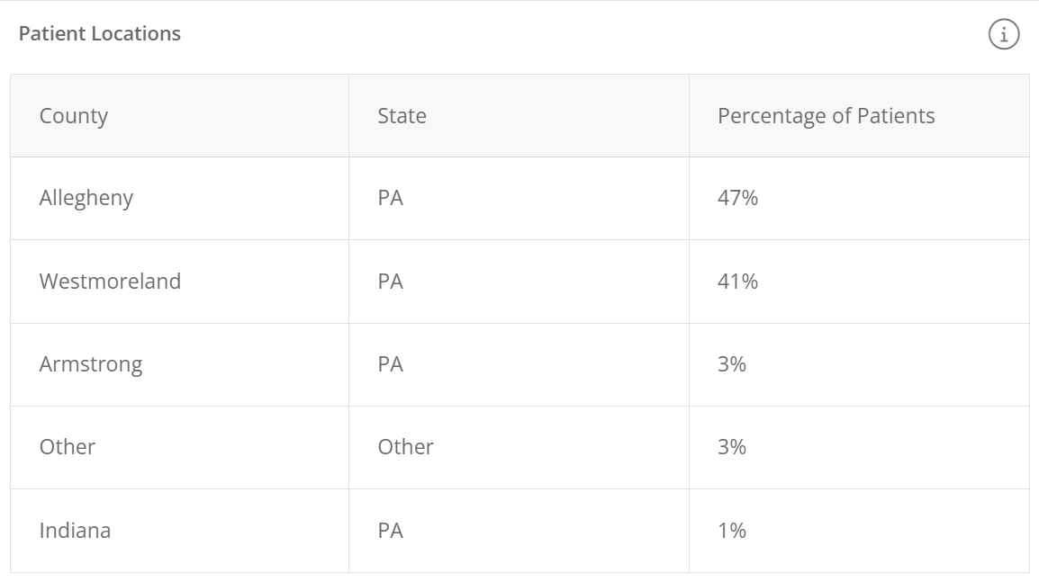 |
Understanding the Metric
![]() Definition
Definition
The partial table displays the five counties where the largest percentages of patients live who were treated by the selected hospital. The county and state are listed, along with the percentage for each county.
![]() Calculation
Calculation
The metric for each county is the percentage of patients treated by the hospital who reside in the listed county.

![]() Where can I find this metric?
Where can I find this metric?
Trella Insights
- In Trella Insights, on the Analyze page for the selected hospital, under the Patient Population tab, the table "Patient Locations - County" contains the complete list of counties.
Trella CRM
- Trella CRM does not provide any additional metrics related to counties of residence.
Chronic Conditions Trella CRM only
| Sales Spotlight on Analyze Page | Sales Spotlight Email | Sales Spotlight in Trella CRM |
| Although the table displayed in Trella CRM is not available in Sales Spotlight, the complete table of chronic condition metrics can be found on the Analyze page for the selected hospital under the Patient Population tab | The Sales Spotlight email does not provide any chronic condition information | 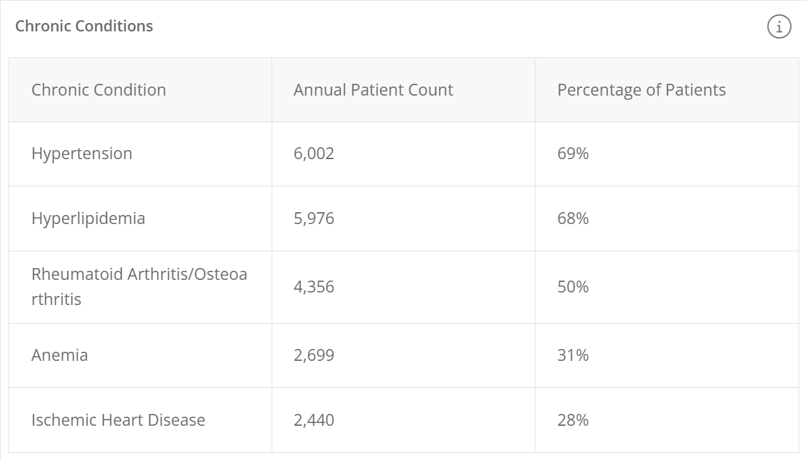 |
Understanding the Metric
![]() Definition
Definition
This table displays the top five most diagnosed chronic conditions for patients treated by the selected hospital during the one year reporting period.
The table has three columns:
- Chronic Condition - name of condition developed from CCW Chronic Condition algorithms that search the CMS administrative claims data for specific diagnosis codes, MS-DRG codes, or procedure codes
- Annual Patient Count - this is the count of distinct patients treated by the selected hospital during the one-year reporting period who met the criteria for the listed chronic condition.
- Percentage of patients- the percentage of the selected hospital's patients who met the criteria for the listed condition.
![]() Calculation
Calculation
In short, we count the number of patients who met the criteria for the listed chronic condition.
What is the criteria?
We follow the CCW chronic condition algorithm that searches the CMS administrative claims data for the specific diagnosis codes, MS-DRG codes, or procedure codes for each chronic condition. For each patient that matches one of the specific criteria, we count that patient for the identified chronic condition.
![]() For those of you who want all of the details, see Lotsa Chronic Conditions Details. This is the source we use for aligning patients to chronic conditions.
For those of you who want all of the details, see Lotsa Chronic Conditions Details. This is the source we use for aligning patients to chronic conditions.
![]() About the percentages
About the percentages
These percentages will probably never add up to 100%. Patients with multiple chronic conditions in their diagnoses will be counted when calculating the percentages in each row. That is, lots of patients impact multiple rows.
![]() Where can I find this metric?
Where can I find this metric?
Trella Insights
- In Trella Insights, on the Analyze page for the selected hospital, under the Patient Population tab, the table "Chronic Conditions" contains the complete list of diagnoses.
Trella CRM
- Trella CRM does not provide any additional diagnoses.
Trella Diagnostic Group Trella CRM only
| Sales Spotlight on Analyze Page | Sales Spotlight Email | Sales Spotlight in Trella CRM |
| Although the table displayed in Trella CRM is not available in Sales Spotlight, the complete table of Trella Diagnostic metrics can be found on the Analyze page for the selected hospital under the Patient Population tab | The Sales Spotlight email does not provide any Trella Diagnostic metrics | 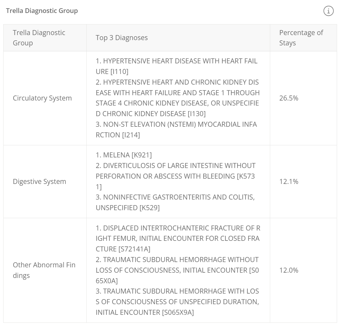 |
Understanding the Metric
![]() Definition
Definition
This table include the top three Trella Health Diagnostic Categories for patients with diagnoses that align with the listed grouping.
The table include the following:
- Trella Diagnostic Grouping - the name of the Trella Health Diagnostic grouping the percentage is based upon
- Top 3 Diagnoses - In order to provide a sense of what kinds of diagnoses are in each grouping, we display the top three diagnoses categories.
- Percentage of Stays - This metric is the percentage of hospital stays where the patient's primary diagnosis listed on the facility claim falls within the listed Trella Health diagnostic group.
![]() For more information, see Trella Health Diagnostic Groupings.
For more information, see Trella Health Diagnostic Groupings.
![]() Calculation
Calculation
The percentage is calculated this way:

![]() Where can I find this metric?
Where can I find this metric?
In Trella CRM, there are no further metrics provided for the Trella Health Diagnostic groupings. In Trella Insights for Home Health, on the Analyze page for the selected hospital, under the Patient Population tab, the complete table of Trella Health Diagnostic groupings are displayed.
Section 2 - How Do I Stand Out?
What's in here?
The second section in Sales Spotlight contains metrics specific to your selected "My Agency."
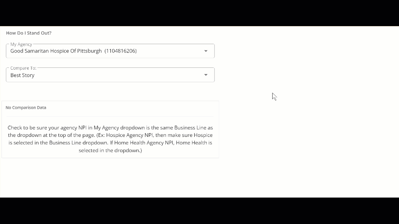
![]() You select your My Agency by choosing it in the dropdown.
You select your My Agency by choosing it in the dropdown.
| Trella Insights (located near the top of Sales Spotlight) | Trella CRM (located at the top of "How Do I Stand Out?") |
 |
 |
![]() The Hospital Sales Spotlight insights have two modes.
The Hospital Sales Spotlight insights have two modes.
|
Conversation Starters Off |
Conversations Starters On |
|
| Click on the images below to enlarge them. | ||
| Trella Insights for HHA | 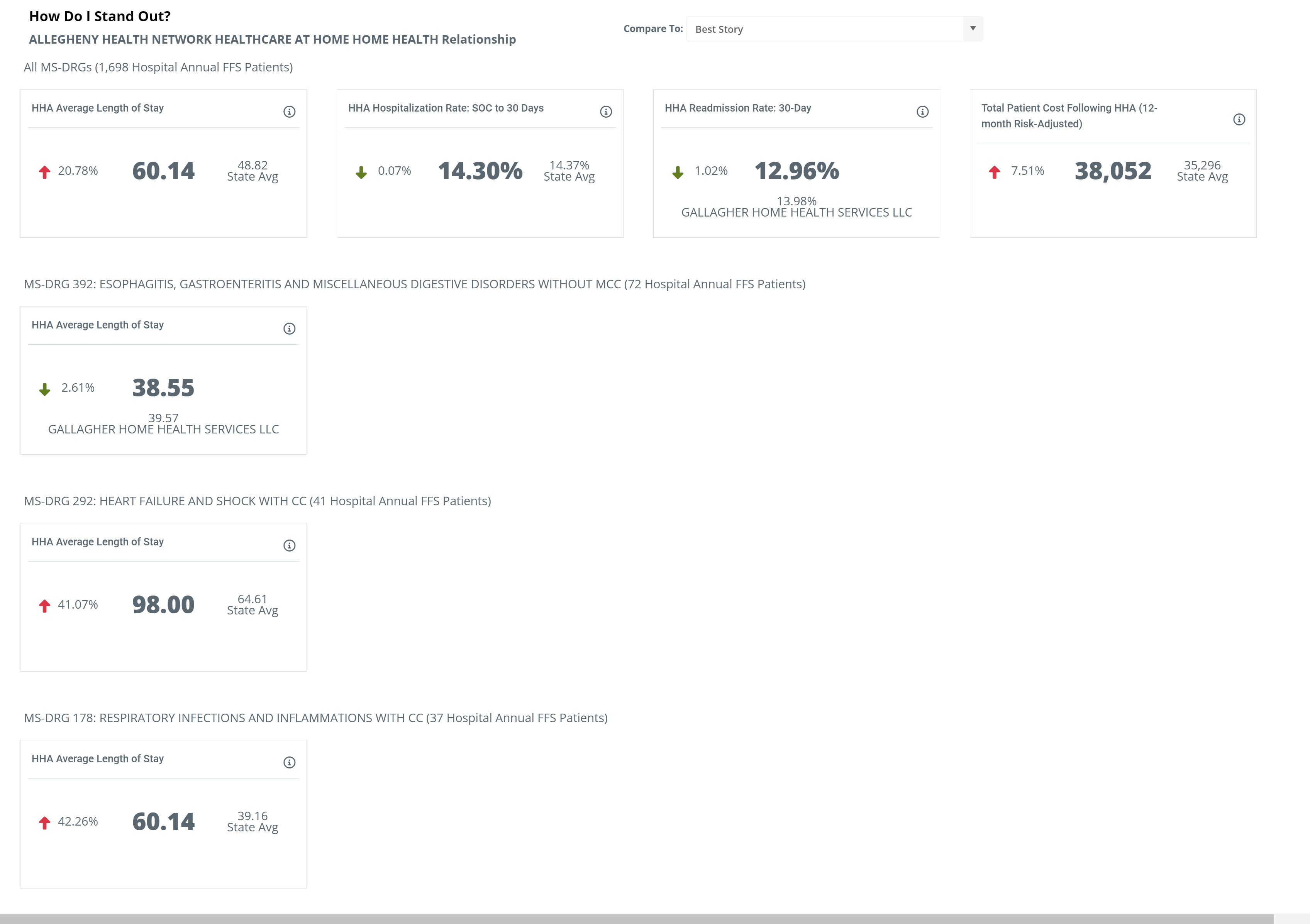 |
 |
| Trella CRM | 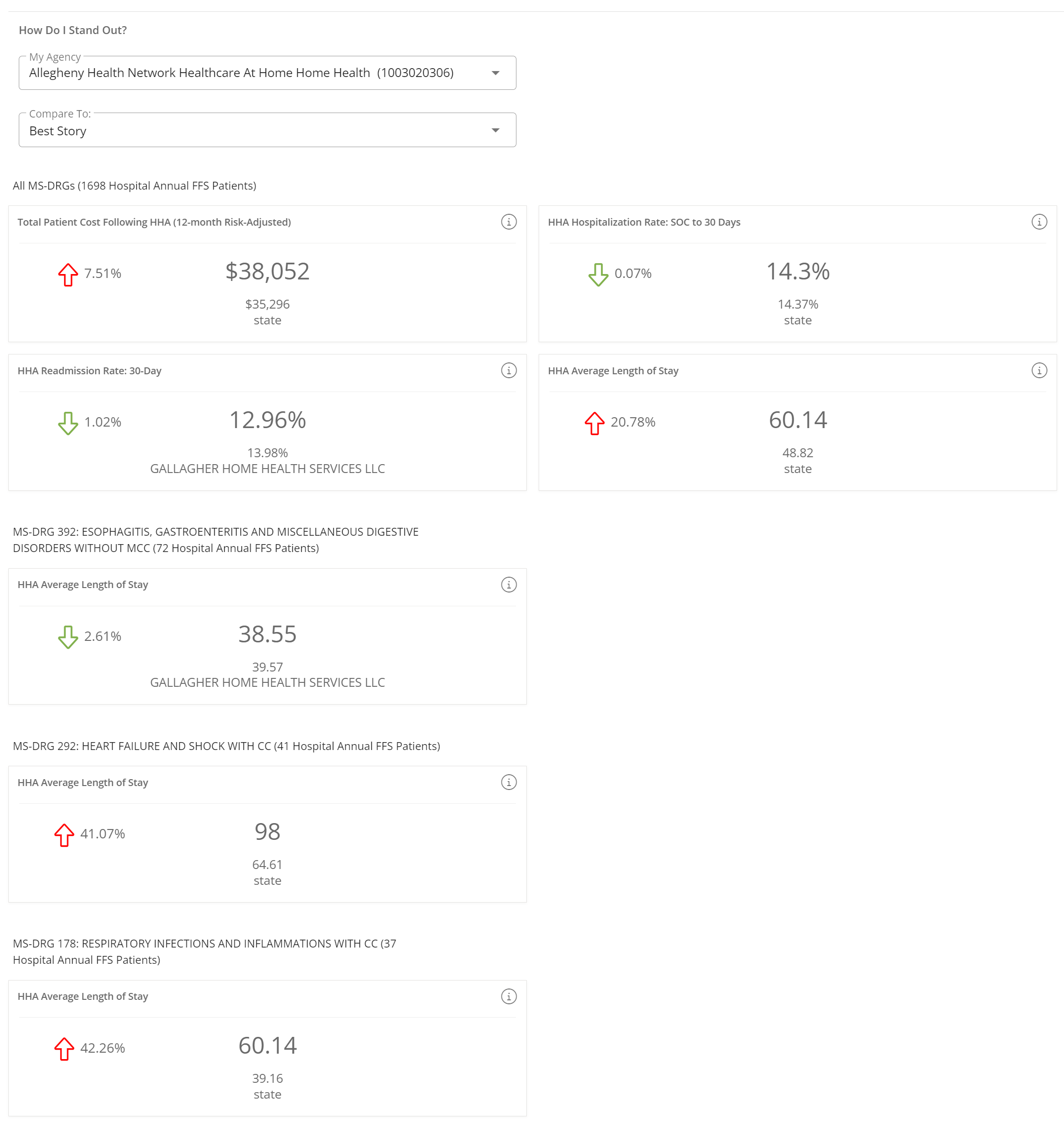 |
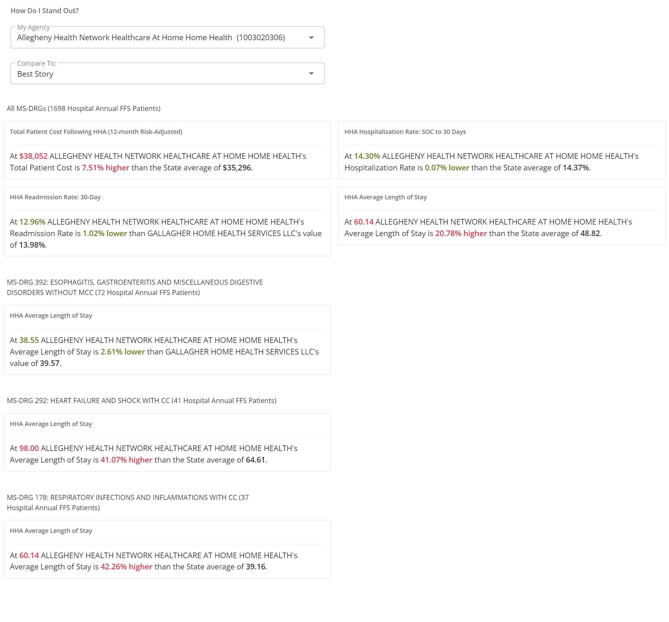 |


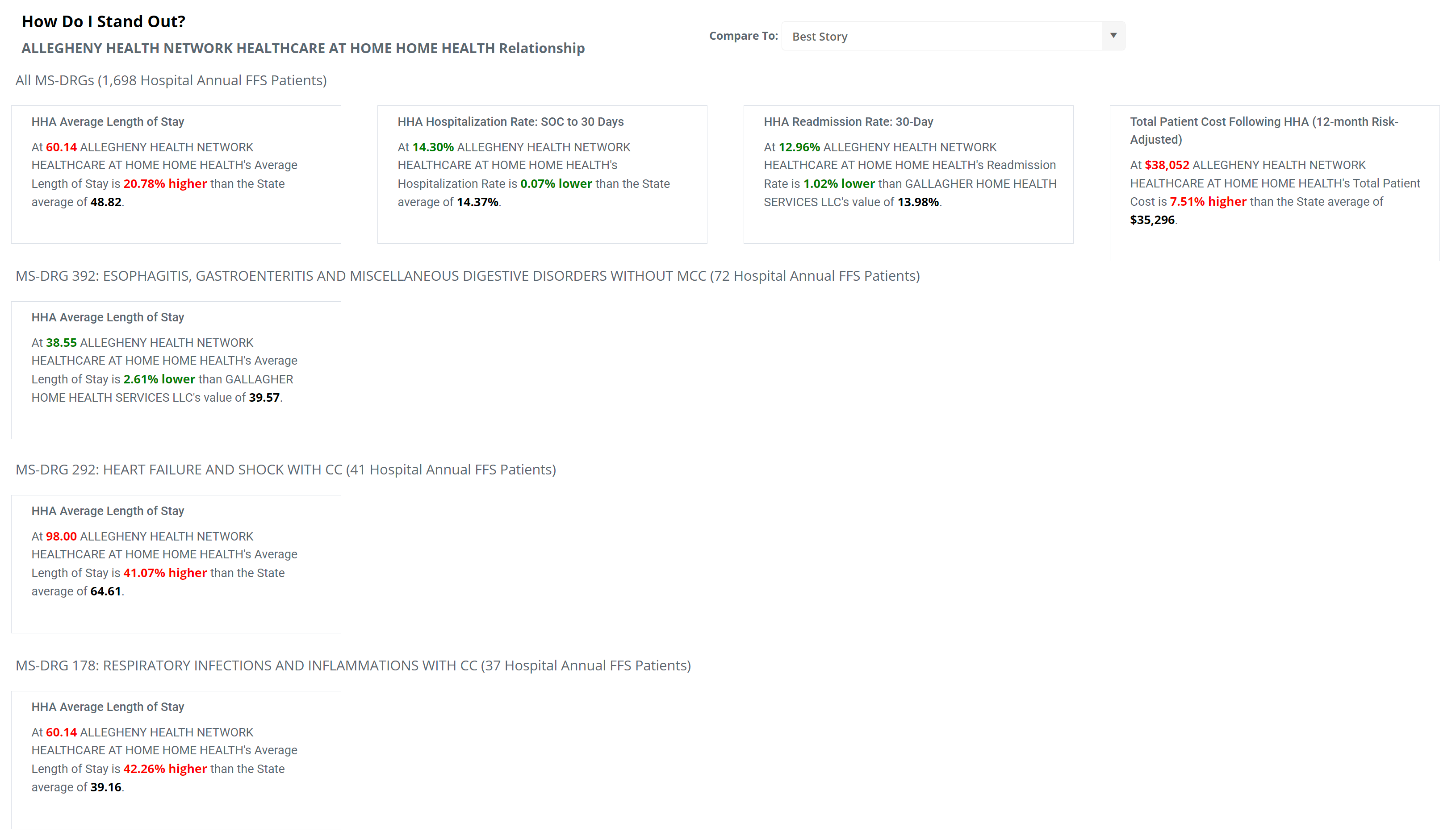
There are four potential metrics that can appear in this section:
- Total Patient Cost Following HHA (12-month Risk-Adjusted) - Average total risk-adjusted Medicare spend per patient during the 12 month follow-up period after admission to the selected HHA
- HHA Hospitalization Rate: SOC to 30 days - Average total risk-adjusted Medicare spend per patient during the 6 month follow-up period after admission to the selected HHA
- HHA Readmission Rate: 30-Day - percentage of the selected facility's patients who were discharged from an inpatient setting, were admitted to the listed home health agency, and were subsequently readmitted to any hospital within 30 days of the first inpatient discharge (based on 2-years of discharges, shifted back 30 days)
- HHA Average Length of Stay - Average number of days spent in the selected HHA for patients with the listed MS-DRG
![]() A few more details about the "How Do I Stand Out?" section"
A few more details about the "How Do I Stand Out?" section"
- Metrics for "All MS-DRGs" will always be included
- Other more specific MS-DRG related metrics will be included if there are enough claims (patients) to generate the metric. In other words, more specific metrics based on specific diagnoses will be included for any MS-DRG that can be calculated.
- As a consequence, if you don't see a specific metric for any MS-DRG, or don't see the MS-DRG in the "How Do I?" section, this means that no metric could be calculated.
Final ![]() - for the examples below, we will look at the four metrics related to All MS-DRGs. The more specific DRG metrics contain the same metrics but the patient populations used for calculating the metrics are limited to patients with the more specific MS-DRG.
- for the examples below, we will look at the four metrics related to All MS-DRGs. The more specific DRG metrics contain the same metrics but the patient populations used for calculating the metrics are limited to patients with the more specific MS-DRG.
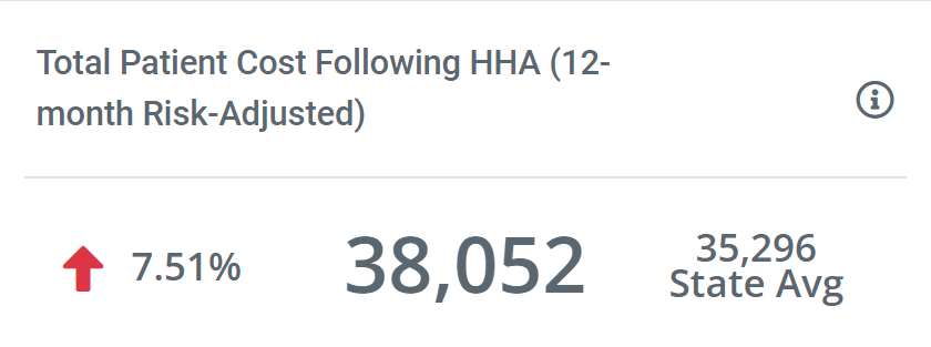
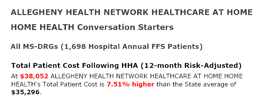
12-month Risk Adjusted Total Patient Cost Following HHA
| Sales Spotlight on Analyze Page | Sales Spotlight Email | Sales Spotlight in Trella CRM |
 |
 |
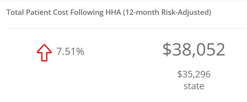 |
Definition
This dollar amount is the average total, risk-adjusted, Medicare spend per patient during the 12-month follow-up period after admission to your agency. From another angle, consider a single patient experience. The patient is admitted to home health care on January 1. From that day, and for the next twelve months, we add up the costs from every Medicare FFS claim for that patient. This will include HHA costs, of course, but it could include Physician visits, other post-acute stays, inpatient stays, DME, everything.
The following image shows a sample of total patient costs from our Report page Total Patient Costs, which includes the same metric(s) displayed comparatively for the sample HHA.
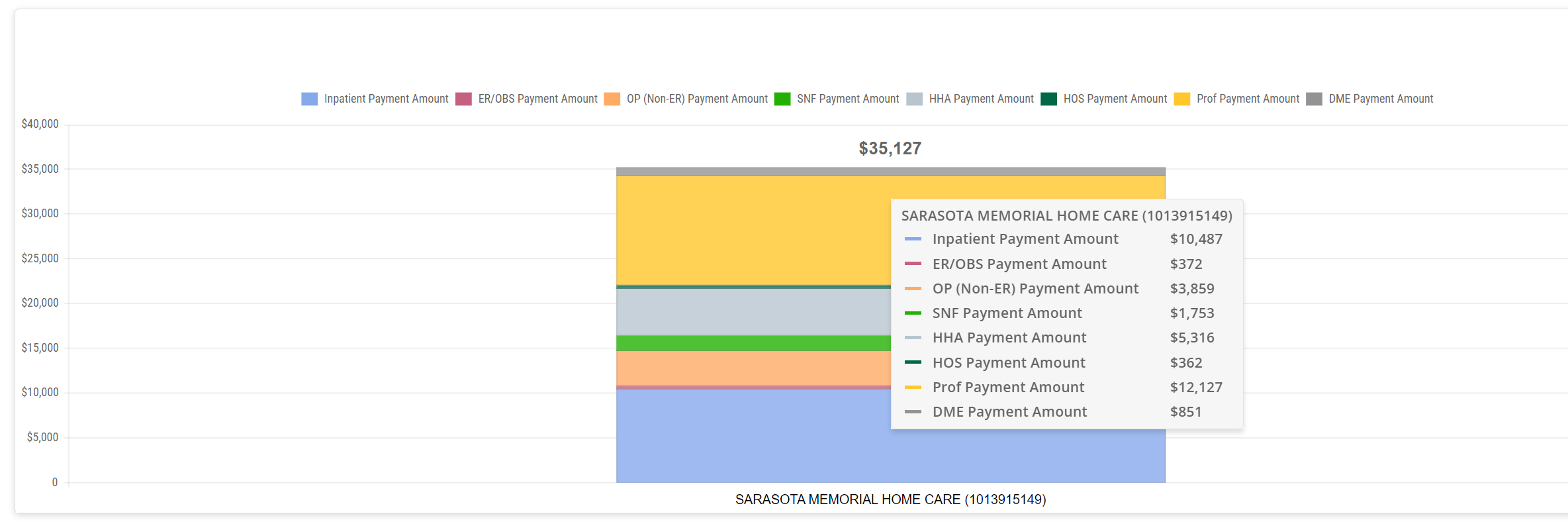 To get the average for all patients, we add up the total patient costs for all patients admitted during the one-year reporting period and divide by the number of patients.
Calculation
This one is simple, we look at every claim submitted during the reference period for each patient, sum them together and divide by the number of patients.
Details
| Conversation Starters Off | Conversation Starters On | |
| Trella Insights for HHA | 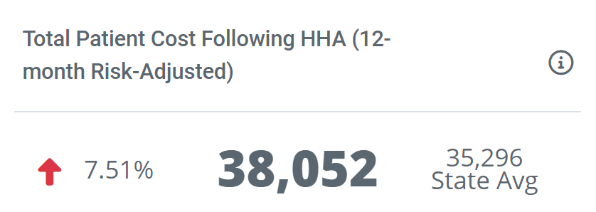 |
 |
| Trella CRM | |
 |
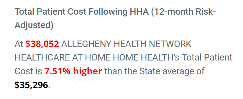
 Comparison
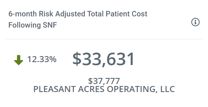
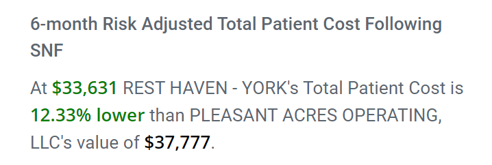
With Conversation Starters on or off, we present the same information. The total patient cost for our selected hospital's patients within 12 months of admission is 38,052 dollars. This is 7.51% higher than the state average, which is indicated by the red color and the red arrow pointing up.
![]() We try to show the best possible scenario for the chosen "My Agency." If the chosen "My Agency" performs better than a competitor, that will be shown in the metric and listed in the Conversation Starter. The percent difference will be green, and the arrow will be green, pointing down. The following example of this is from the Hospital Sales Spotlight for a Skilled Nursing Facility and shows what a higher performing agency looks like:
We try to show the best possible scenario for the chosen "My Agency." If the chosen "My Agency" performs better than a competitor, that will be shown in the metric and listed in the Conversation Starter. The percent difference will be green, and the arrow will be green, pointing down. The following example of this is from the Hospital Sales Spotlight for a Skilled Nursing Facility and shows what a higher performing agency looks like:
 |
 |
Where can I find this metric?
In addition to the Hospital Sales Spotlight on the Analyze page, you can find these metrics:
Trella Insights
On the Reports page, under the Total Patient Cost tab, you can create a report that includes your chosen "My Agency." This report also allows you to choose several settings to vary the results in the report.
Trella CRM
- This metric is not found anywhere else in Trella CRM.
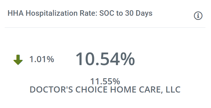
HHA Hospitalization Rate: SOC to 30 days
| Sales Spotlight on Analyze Page | Sales Spotlight Email | Sales Spotlight in Trella CRM |
 |
 |
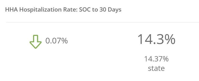 |
Definition
This is the percentage of admissions (patients) to "My Agency" who were admitted to inpatient care within 30 days of the start of care at "My Agency."
![]() For more information, see Hospitalization.
For more information, see Hospitalization.
Calculation
This metric is the percentage of patients admitted to "My Agency" who were then admitted to inpatient (hospital) care within 30 days of home health start of care. Here's the equation:

Details
| Conversation Starters Off | Conversation Starters On | |
| Trella Insights for HHA | 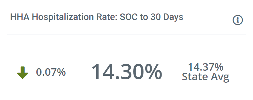 |
 |
| Trella CRM | |
 |
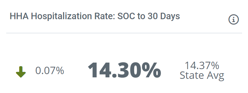
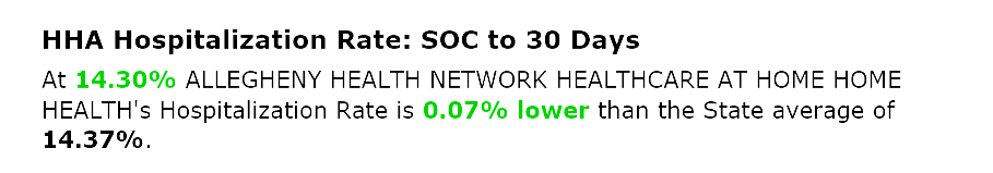
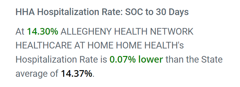
As with all of the "How Do I Stand Out?" metrics, we try to show a favorable comparison. In this case, Allegheny's SOC to 30 days hospitalization is higher than the state average by 0.07%. With the Conversation Starters on, this difference is stated as a sentence.
The images below, from a different "My Agency" show what a good performing agency looks like.
 |
 |
With Conversation Starters off, the green arrow ![]() indicates that the hospitalization rate for the chosen "My Agency" is lower, and therefore better than the listed competitor. The rate for the competitor is listed below the main metric.
indicates that the hospitalization rate for the chosen "My Agency" is lower, and therefore better than the listed competitor. The rate for the competitor is listed below the main metric.
With Conversation Starters on, the competitive advantage is presented in a sentence.
Where can I find this metric?
![]() Remember that in the relationship section, the insights are tied to the home health agency (My Agency), not the selected hospital, so the metrics displayed will be found on the Home Health Analyze pages for any HHA included in the Sales Spotlight insights.
Remember that in the relationship section, the insights are tied to the home health agency (My Agency), not the selected hospital, so the metrics displayed will be found on the Home Health Analyze pages for any HHA included in the Sales Spotlight insights.
In addition to the Hospital Sales Spotlight on the Analyze page, you can find these metrics:
Trella Insights
- If you create a default presentation for the selected hospital, the metric appears in the Home Health Destinations table and in the Hospitalizations and Readmission Rates chart. The matching metric will only appear if you select the same HHA for comparison in the report.
- For the chosen "My Agency":
- On the home health Analyze page, this metric will be visible in the Insights for the agency.
- On the home health Analyze page, under the Quality tab, this metric is broken down in crazy detail in the table, Hospitalization Rates within 30 Days from Start of Care by Acuity.
- On the Explore page, this metric will be found in the row for the chosen "My Agency." (And in the row for the competitor)
Trella CRM
- This metric is not found anywhere else in Trella CRM.
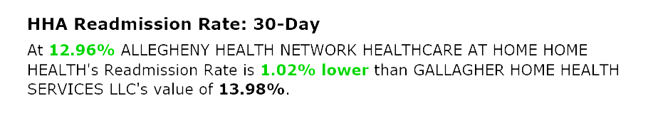
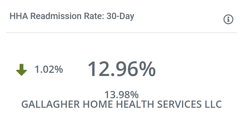
HHA Readmission Rate: 30-Day
| Sales Spotlight on Analyze Page | Sales Spotlight Email | Sales Spotlight in Trella CRM |
 |
|
 |
Definition
A readmission is a care event where a patient is admitted to any inpatient stay within 30 days of being discharged from an inpatient stay. Like this: INP D/C ![]() INP (RE)Admission within 30 days.
INP (RE)Admission within 30 days.
The Readmission Rate in this Sales Spotlight Insight is the percentage of discharged patients who were admitted to home care at the chosen agency and readmitted to inpatient care within 30 days of the initial discharge.
Calculation
This metric is the percentage of patients discharged from a hospital inpatient stay who were admitted the chosen home health agency and then readmitted to an inpatient stay at any hospital within 30 days of the initial discharge. The following equation shows the basics:

Details
| Conversation Starters Off | Conversation Starters On | |
| Trella Insights for HHA | |
 |
| Trella CRM | |
 |
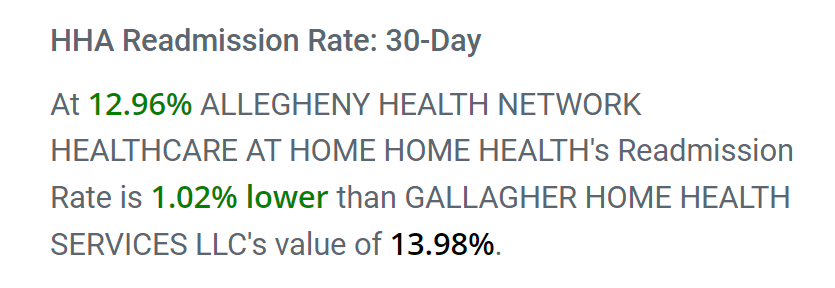
With Conversation Starters off, the insight shows the main metric (12.96%) and reveals the competitive position with the percentage difference between the chosen "My Agency" and a competitor, listed below. The green arrow, pointing down, ![]() indicates that the readmission rate for "My Agency" is lower than the metric for the listed competitor. The green indicates a win for the selected "My Agency".
indicates that the readmission rate for "My Agency" is lower than the metric for the listed competitor. The green indicates a win for the selected "My Agency".
![]() If the readmission rate for the chosen "My Agency" is higher than all competitors, the rate will be compared to the county and state averages. If none of the comparisons are favorable, a comparison will be made to the state average, the difference will be on the left with a red arrow,
If the readmission rate for the chosen "My Agency" is higher than all competitors, the rate will be compared to the county and state averages. If none of the comparisons are favorable, a comparison will be made to the state average, the difference will be on the left with a red arrow, ![]() pointing up to indicate that no favorable comparison can be made.
pointing up to indicate that no favorable comparison can be made.
With Conversation Starters on, the comparison is stated as a sentence.
Where can I find this metric?
In addition to the Hospital Sales Spotlight on the Analyze page, you can find these metrics:
Trella Insights
- On the home health Analyze page for the chosen "My Agency," under the Insights tab, there is one Insight called, Readmission Rate: 30-Day.
- On the home health Analyze page for the chosen "My Agency," under the Quality tab, there are a number of tables that include a variety of readmission rates, Trended Hospitalization Rates, Readmission Rates, and Length of Stay & Readmission Rates - by Clinical Group.
- On the Explore page, in the row for every home health agency, there is a column for this metric.
Trella CRM
- This metric is not found anywhere else in Trella CRM.
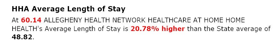
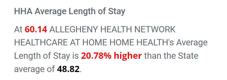
HHA Average Length of Stay
| Sales Spotlight on Analyze Page | Sales Spotlight Email | Sales Spotlight in Trella CRM |
 |
 |
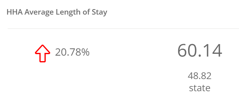 |
Definition
The average number of patient days spent in the selected home health agency.
![]() For detailed information, see Average Length of Stay.
For detailed information, see Average Length of Stay.
Calculation
This one is an average, add up all the patient days, divide by the number of patients.
Details
| Conversation Starters Off | Conversation Starters On | |
| Trella Insights for HHA | |
 |
| Trella CRM | |
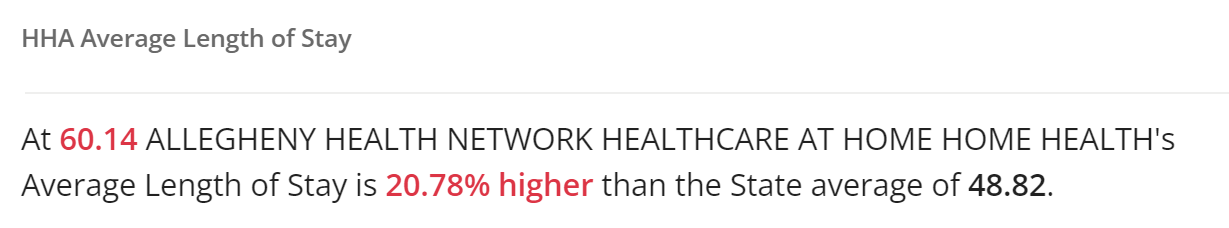 |
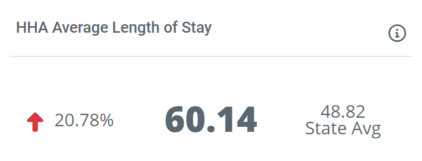
With Conversation Starters off, the average length of stay for the chosen "My Agency" will be displayed. Since comparison is the purpose of this tile, to the left the percentage advantage or disadvantage is displayed along with an arrow. In this case, a red arrow, pointing up, ![]() . This indicates that the chosen "My Agency" has a higher average for lengths of stay in comparison with the state average.
. This indicates that the chosen "My Agency" has a higher average for lengths of stay in comparison with the state average.
![]() If the average length of stay for the chosen "My Agency" is better than any competitor, the percentage difference will be displayed, along with a green arrow,
If the average length of stay for the chosen "My Agency" is better than any competitor, the percentage difference will be displayed, along with a green arrow, ![]() pointing down, indicating that the average days of care are than the competitor. The name of the competitor will be listed.
pointing down, indicating that the average days of care are than the competitor. The name of the competitor will be listed.
With Conversation Starters on, the comparison is presented in a sentence.
Where can I find this metric?
In addition to the Hospital Sales Spotlight on the Analyze page, you can find these metrics:
Trella Insights
- On the home health Analyze page for the chosen "My Agency," under the Quality tab, there is a table that breaks out average length of stay metrics by diagnostic groups, Length of Stay by Trella Diagnostic Group.
Trella CRM
- This metric is not found anywhere else in Trella CRM.