Overview
The goal of this exercise is to help you look at your territory by county and confirm true competitors and how they compare to your agency by admission volume trends in a common territory / service area. This activity is an essential building block to additional activities in Trella Insights.
![]() This is a process that you will want to do periodically as new quarters of data are released and for different markets and lines of business.
This is a process that you will want to do periodically as new quarters of data are released and for different markets and lines of business.
![]() As with any data analysis, it is important to use the metrics you find to ask the right questions for further investigation. If a count or performance metric is high, or low, you need to ask, why? The answer to this question will point you to other metrics that will provide additional clarity.
As with any data analysis, it is important to use the metrics you find to ask the right questions for further investigation. If a count or performance metric is high, or low, you need to ask, why? The answer to this question will point you to other metrics that will provide additional clarity.
![]() In this article, we have included some content that is specific to each post-acute provider type for which a Trella product exists; hospice, home health, and skilled nursing. In the cases where a single image from one post-acute provider type is sufficient to represent any of the three, we have not included an image for each to save space.
In this article, we have included some content that is specific to each post-acute provider type for which a Trella product exists; hospice, home health, and skilled nursing. In the cases where a single image from one post-acute provider type is sufficient to represent any of the three, we have not included an image for each to save space.
The Steps
The following four steps summarize the overall process to make it easier to remember. The more detailed process is below.
- Examine the Market Share page
- Create a custom list of competitors and include your own agency
- Use the custom list on the Explore page
- Determine your competitive strengths
 Market Share details for each line of business
The following links will open articles with details on the Market Share report for each Trella Insights line of business
Examine the Market Share Page
Select a Market
Start by selecting a local market.
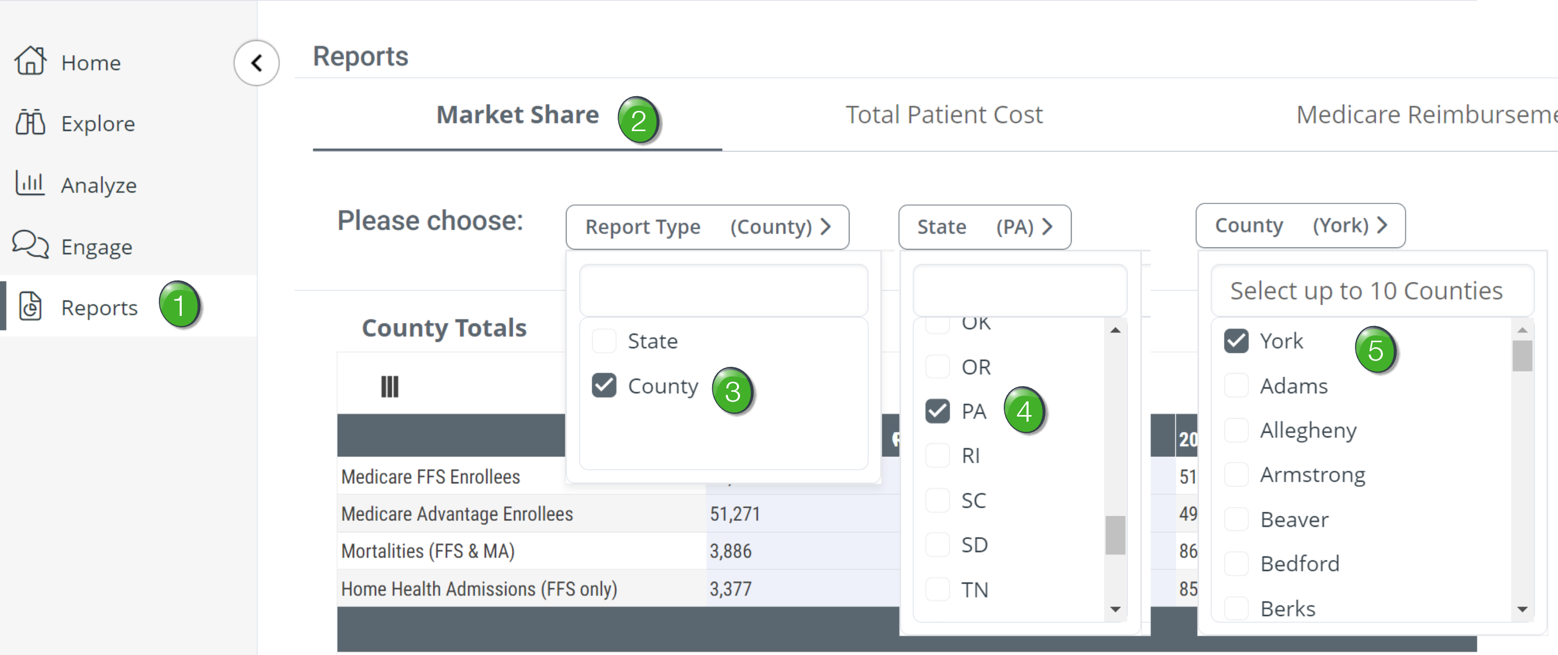
![]() Click on Reports in the left navigation. You can do this from anywhere in Trella Insights.
Click on Reports in the left navigation. You can do this from anywhere in Trella Insights.
![]() Some users will not have access to the Reports page based on the Trella Insights role assigned to them. If you are unable to see the reports page and think you would benefit from this process, please make contact with your Trella Health account administrator to receive access.
Some users will not have access to the Reports page based on the Trella Insights role assigned to them. If you are unable to see the reports page and think you would benefit from this process, please make contact with your Trella Health account administrator to receive access.
![]() At the top of the page, click on the Market Share tab.
At the top of the page, click on the Market Share tab.
![]() All available reports are listed in the tabs across the top of the Reports page. Each line of business has different reports available.
All available reports are listed in the tabs across the top of the Reports page. Each line of business has different reports available.
![]() Choose County in the "Report Type" selector.
Choose County in the "Report Type" selector.
![]() Choose your state from the list.
Choose your state from the list.
![]() Finally, select your county. You can choose up to 10 counties.
Finally, select your county. You can choose up to 10 counties.
Examine the top table - County Totals
This table provides counts of Enrollees who reside in your selected county broken out by a few different categories and trended across 8 quarters.
 What to look for
- Look at the number of Medicare FFS enrollees or the Medicare Advantage enrollees as the opportunity in each county; these are the enrolled beneficiaries who physically live in the selected county.
- Look for trends over the eight quarters. Are Medicare FF of Medicare Advantage enrollees increasing or decreasing
- Look for trends in admission counts.
- What are the right questions to ask? Example: Compare the trend of overall patients to the trend of home health admissions, hospice admissions, or skilled nursing admissions. In general, if the overall enrollee population is increasing over time, but the admissions are steady or declining, this could indicate a need for increased education on the value of post-acute care.
![]() For more information about specific usage per line of business, see the detailed Market Share articles listed above.
For more information about specific usage per line of business, see the detailed Market Share articles listed above.
Home Health Totals table
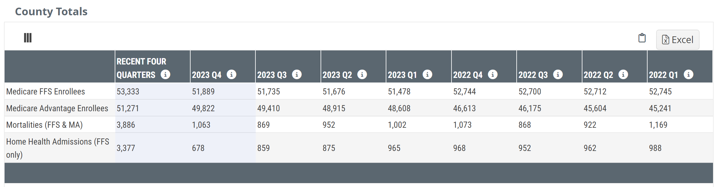
| Columns | |
| First Column - unnamed | The first column identifies the source and type of metrics in each row (See details below) |
| Recent Four Quarters |
This is a count of the patient type listed in the row for the most recent year (four quarters)
|
| Year Quarter - 20XX QY | This is a count of the patient type listed in the row for the quarter listed in the header |
| Rows | |
|
Medicare FFS Enrollees |
This row shows the counts of Medicare patients enrolled in Medicare FFS residing in the selected state or county/counties during the period listed in the column header. |
|
Medicare Advantage Enrollees |
This row shows the counts of patients enrolled in Medicare Advantage residing in the selected state or county/counties during the period listed in the column header. |
| Mortalities (FFS & MA) | The count of all Medicare FFS or Medicare Advantage patients who died during the period identified for the column. |
| Home Health Admissions Total (FFS only) | This row shows the counts of admissions to home health care during the period listed in the column. The counts in this row were compiled from only Medicare FFS claims. |
![]() Enrollees - These metrics are counts of patients enrolled in FFS or MA based on the Master Beneficiary Summary File, not from Medicare FFS or MA claims.
Enrollees - These metrics are counts of patients enrolled in FFS or MA based on the Master Beneficiary Summary File, not from Medicare FFS or MA claims.
![]() For more information, see ResDAC's article: Enrollment Source.
For more information, see ResDAC's article: Enrollment Source.
Hospice Totals table
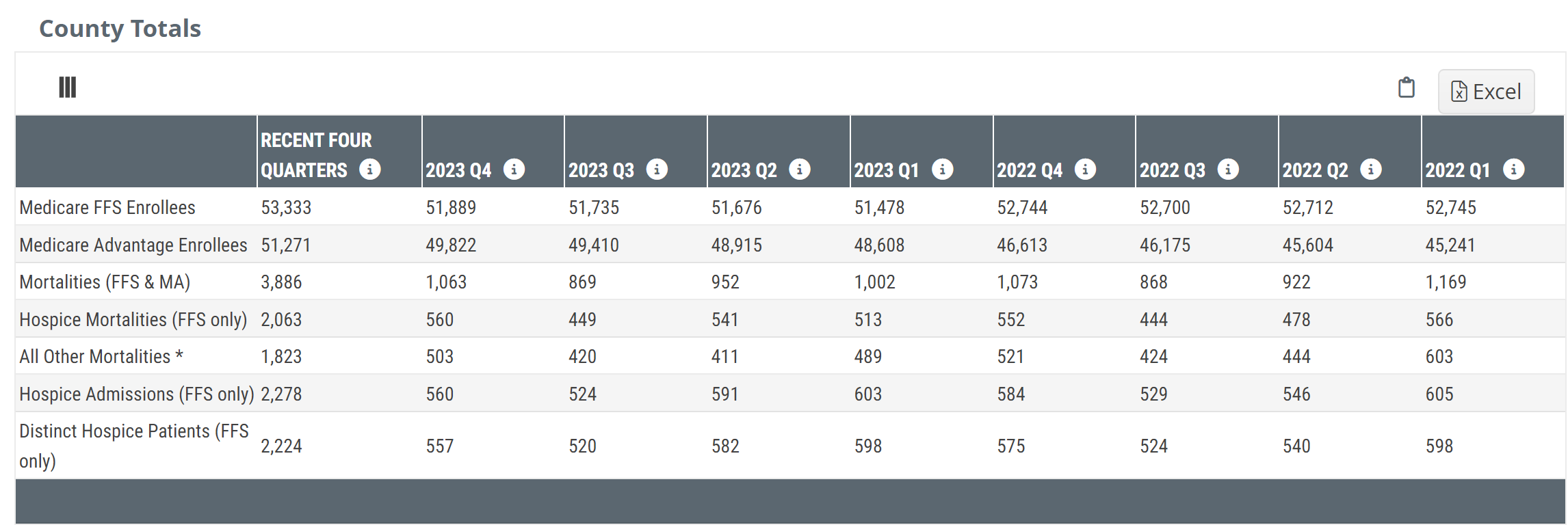
| Columns | |
| First Column - unnamed | The first column identifies the source and type of metrics in each row (See details below) |
| Recent Four Quarters | This is a count of the patient type listed in the row for the most recent year (four quarters) |
| Year Quarter - 20XX QY | This is a count of patient type listed in the row for the quarter listed in the header |
| Rows | |
|
Medicare FFS Enrollees |
This row shows the counts of people enrolled in Medicare FFS during the period listed in the column header. |
|
Medicare Advantage Enrollees |
This row shows the counts of people enrolled in Medicare Advantage during the period listed in the column header. |
|
Mortalities (FFS & MA) Enrollees |
The counts of all Medicare FFS or Medicare Advantage patients who died during the period identified for the column.
|
| Hospice Mortalities (FFS Only) |
The metrics in this row are the counts of Medicare FFS mortalities who died who received hospice care. Please see note |
| All Other Mortalities |
Any other patient who died who was not under Medicare FFS. Please see note |
| Hospice Admissions (FFS only) | These are the subset counts of admissions to hospice during the period listed in the column. The counts in this row were compiled from only Medicare FFS claims. |
| Distinct Hospice Patients (FFS Only) | These metrics are the subset counts of distinct patients for whom a claim was submitted by a hospice during the period listed in the column. The counts in this row were compiled from only Medicare FFS claims. |

![]() Enrollees - These metrics are counts of patients enrolled in FFS or MA based on the Master Beneficiary Summary File, not from Medicare FFS or MA claims.
Enrollees - These metrics are counts of patients enrolled in FFS or MA based on the Master Beneficiary Summary File, not from Medicare FFS or MA claims. ![]() For more information, see ResDAC's article: Enrollment Source.
For more information, see ResDAC's article: Enrollment Source.
![]() Prior to 2021, hospice services were only provided as part of the traditional Medicare FFS program. Beginning in 2021, some MA plans began to provide hospice coverage through the Value-Based Insurance Design (VBID) program. Medicare Advantage patients whose plans are not part of the VBID program are included in the hospice mortalities (FFS only) count. MA Patients who received their hospice care through the VBID program will be included in the All Other Mortalities row.
Prior to 2021, hospice services were only provided as part of the traditional Medicare FFS program. Beginning in 2021, some MA plans began to provide hospice coverage through the Value-Based Insurance Design (VBID) program. Medicare Advantage patients whose plans are not part of the VBID program are included in the hospice mortalities (FFS only) count. MA Patients who received their hospice care through the VBID program will be included in the All Other Mortalities row.
Skilled Nursing totals table
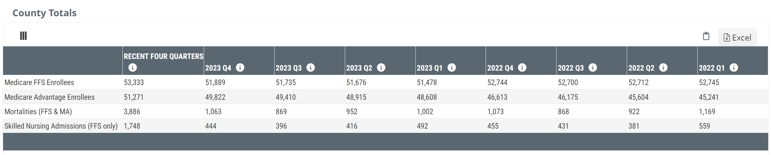
| Columns | |
| First Column - unnamed | The first column identifies the source and type of metrics in each row (See details below) |
| Recent Four Quarters | This is a count of the patient type listed in the row for the most recent year (four quarters) |
| Year Quarter - 20XX QY | This is a count of the patient type listed in the row for the quarter identified in the header |
| Rows | |
|
Medicare FFS Enrollees |
This row shows the counts of Medicare patients enrolled in Medicare FFS residing in the selected state or county/counties during the period listed in the column header. |
|
Medicare Advantage Enrollees |
This row shows the counts of patients enrolled in Medicare Advantage residing in the selected state or county/counties during the period listed in the column header. |
| Mortalities (FFS & MA) | The count of all Medicare FFS or Medicare Advantage patients who died during the period identified for the column. |
| Skilled Nursing Admissions (FFS only) | This row shows the counts of admissions to skilled nursing care during the period listed in the column. The counts in this row were compiled from only Medicare FFS claims. |
![]() Enrollees - These metrics are counts of patients enrolled in FFS or MA based on the the Master Beneficiary Summary File, not from Medicare FFS or MA claims.
Enrollees - These metrics are counts of patients enrolled in FFS or MA based on the the Master Beneficiary Summary File, not from Medicare FFS or MA claims.
![]() For more information, see ResDAC's article: Enrollment Source.
For more information, see ResDAC's article: Enrollment Source.
Connecting the "Totals" table with the "Market Share" tables
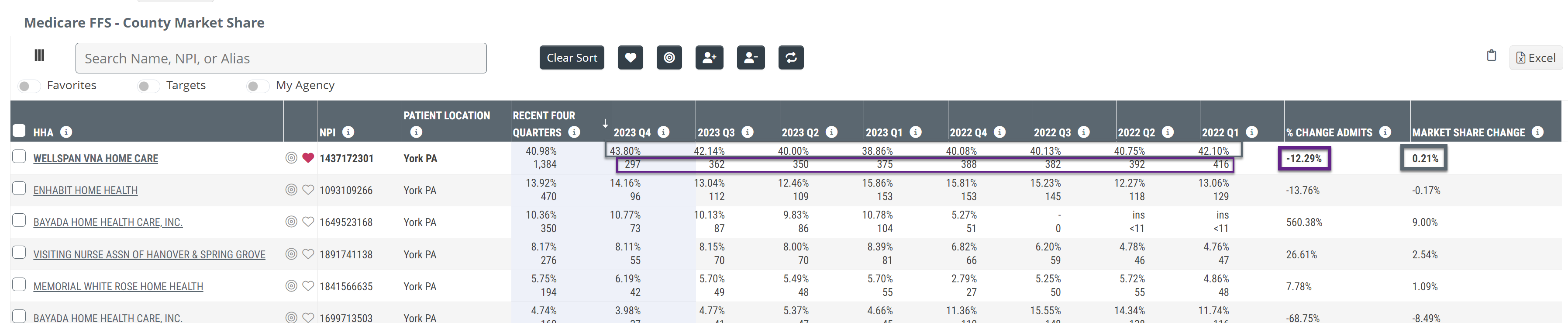
The top table contains counts of enrollees, mortalities and admissions for the selected county. The bottom table breaks down those patient populations by the providers that admitted the patients. For example, in 2023 - Quarter 1, there were 965 patients admitted in our selected county. In the bottom table, in the matching column, we can identify the provider along with the admission counts and the market share percentage.
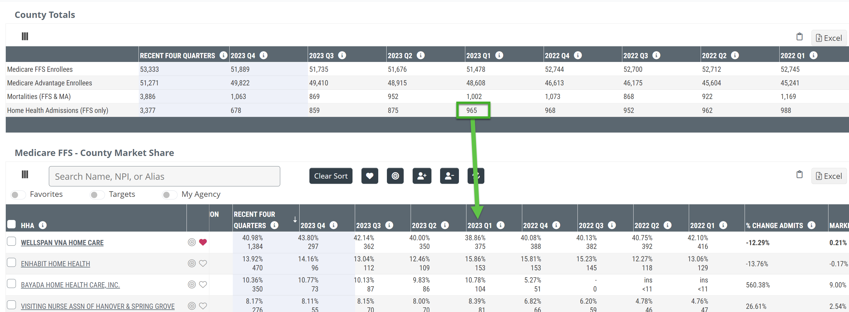
![]() From the above screenshot, we can see how the market share percentage is calculated. For the example, consider the metrics for Wellspan VNA Home Care.
From the above screenshot, we can see how the market share percentage is calculated. For the example, consider the metrics for Wellspan VNA Home Care.
Numerator - the count of admissions to Wellspan during quarter 1 of 2023 - 375 admissions
Denominator - the count of admissions to all home health agencies in the selected market during quarter 1 of 2023 - 965
The market share is calculated using the following formula:
The market share of 38.86% is shown as the top metric.
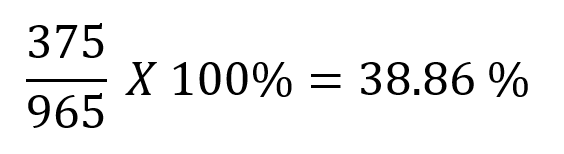
Create a custom list
![]() The goal is to create a custom list of your agency in the selected market along with the top competitors. This list can then be used on other pages in Trella Insights.
The goal is to create a custom list of your agency in the selected market along with the top competitors. This list can then be used on other pages in Trella Insights.
What to do
Follow these steps to create a custom list of top providers of interest
- Click on the checkboxes to the left of the names of the providers you want to include in your custom list
![]() Remember to add your company's "My Agency" to the list. Your company's list of "My Agencies" will be displayed with bold print in the table. (In the image below, the "My Agency" for the demo account is Wellspan VNA Home Care.
Remember to add your company's "My Agency" to the list. Your company's list of "My Agencies" will be displayed with bold print in the table. (In the image below, the "My Agency" for the demo account is Wellspan VNA Home Care.
- Click on the
 icon above the table.
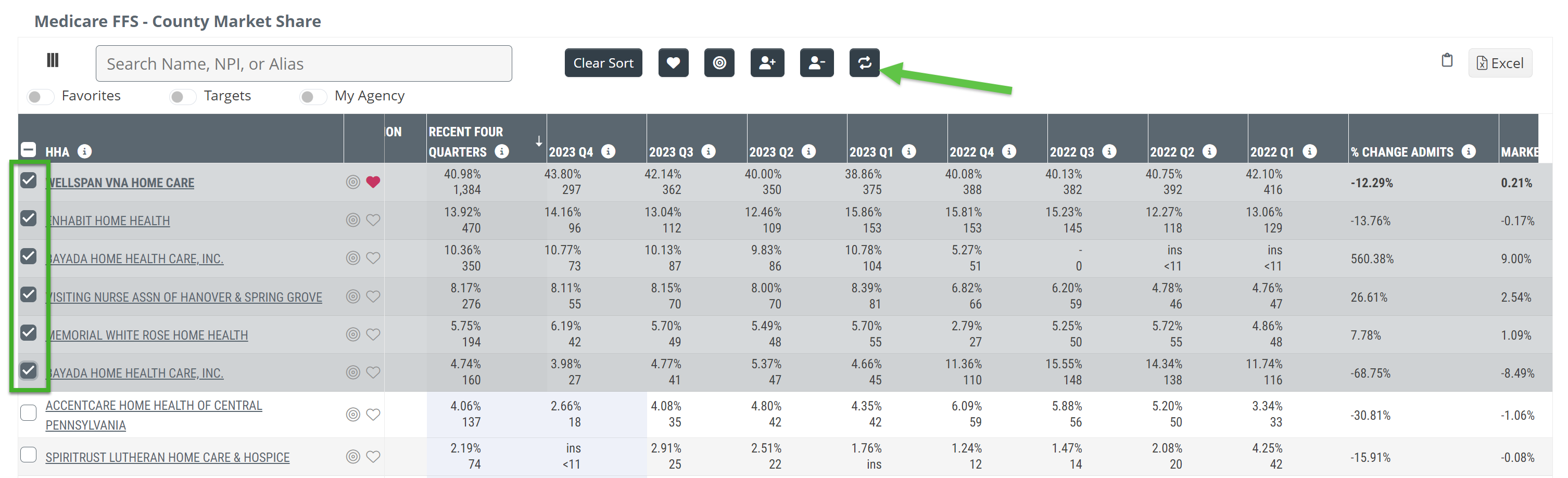
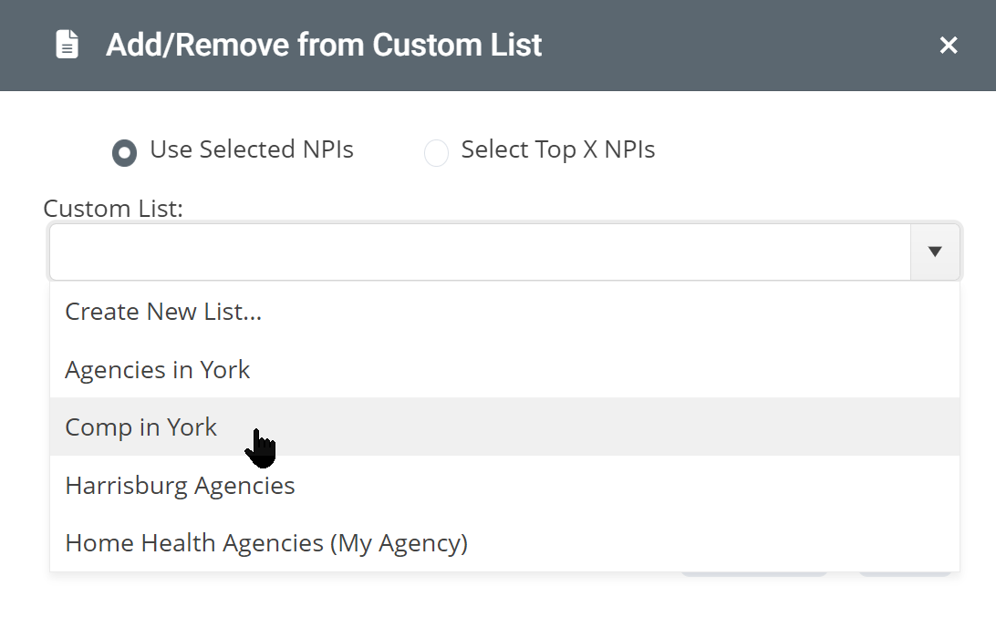
The Add/Remove from Custom List dialog box will open.
![]() A list of current custom lists will appear. You can add the selected providers to an existing list.
A list of current custom lists will appear. You can add the selected providers to an existing list.
- For this example, click on the "Create New List..." link
The following dialog box will open.
- Enter a name for your custom list in the top field.
- You can add an optional description in the bottom field
- Click on the "Save" button
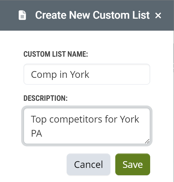
![]() Naming your list - It is a good idea to add details to the custom list name that will help you to identify it later. If you perform competitive analyses for multiple markets, you will end up with a good number of custom lists to choose from.
Naming your list - It is a good idea to add details to the custom list name that will help you to identify it later. If you perform competitive analyses for multiple markets, you will end up with a good number of custom lists to choose from.
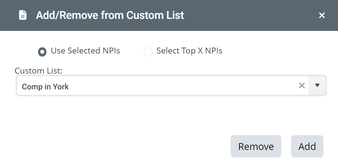
The new custom list will be available to choose in the "Add/Remove from Custom List" dialog box.
- Click on the new custom list in the list.
- Click the "Add" button to add the selected providers to your custom list.
![]() Now pick another county you serve and follow the same process. Or, proceed to the final step...
Now pick another county you serve and follow the same process. Or, proceed to the final step...
Comparing Growth on the Market Share page
![]() For a detailed description of the Market Share tables, see the line of business specific articles listed above.
For a detailed description of the Market Share tables, see the line of business specific articles listed above.
The County Market Share or State Market Share table shows the percentage change of two metrics over time, patient counts (blue) and Market Share (gray). The numbers and percentages that are used to calculate the change are shown in the eight quarterly columns. The change over the most recent four quarters is indicated in the last two columns.
![]() The ideal is to have positive percentages in both columns, % Change Admits, and Market Share Change. It is important to look at both. In a diminishing market (overall, fewer patients), it is possible to have an increasing share of the market while admitting fewer patients.
The ideal is to have positive percentages in both columns, % Change Admits, and Market Share Change. It is important to look at both. In a diminishing market (overall, fewer patients), it is possible to have an increasing share of the market while admitting fewer patients.
![]() click on the image above to expand it to full size.
click on the image above to expand it to full size.
Agency/Facility comparison - Explore page
Populate the Explore page with
Now that you have identified your competitors, compare your list of agencies to identify your competitive advantage. Viewing your custom list on the Explore page will allow you to compare your "My Agency" to the competitors using the most extensive spread of metrics available in Trella Insights.
![]() Click on the "Explore" button in the left navigation
Click on the "Explore" button in the left navigation
![]() Click on the appropriate provider type for the line of business you want to compare.
Click on the appropriate provider type for the line of business you want to compare.
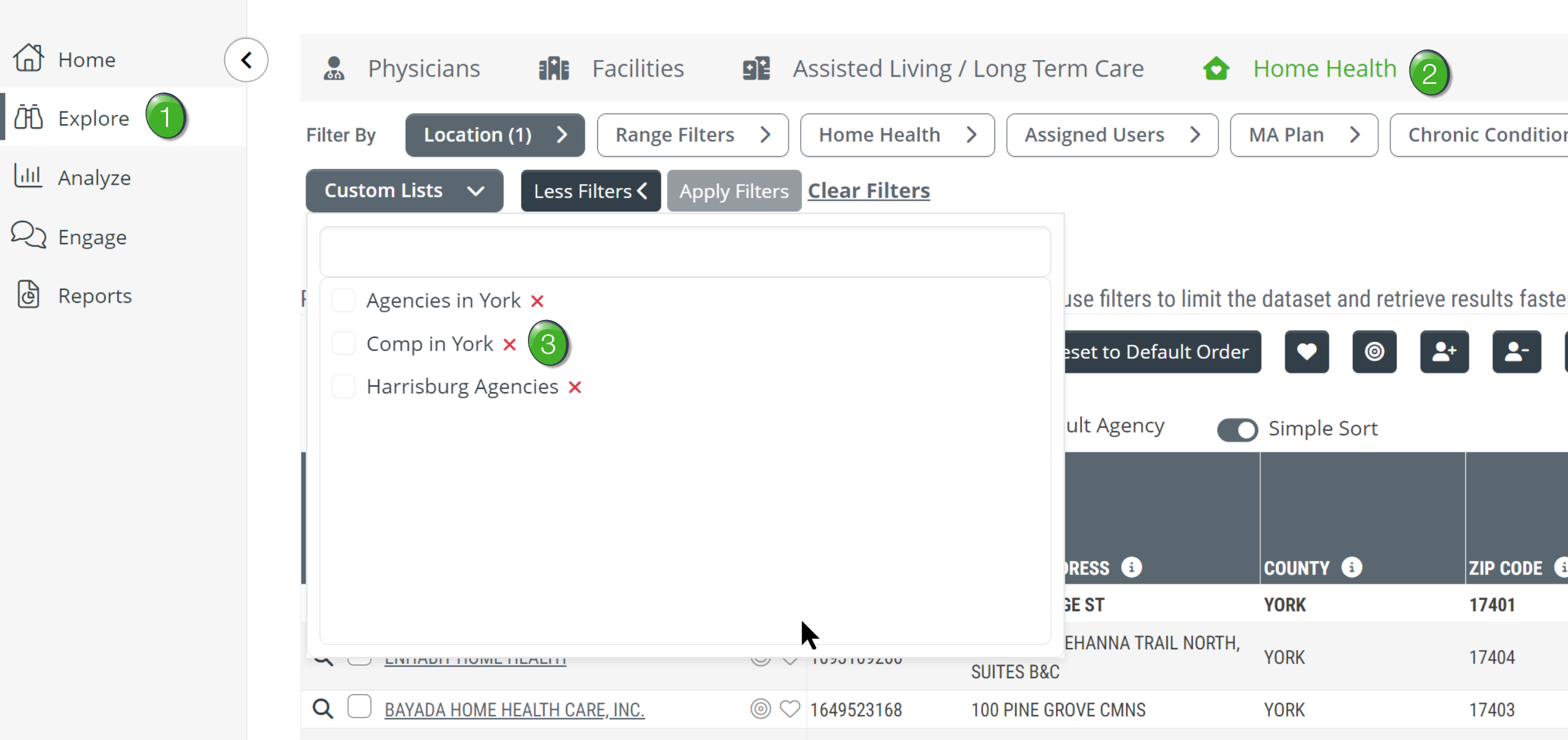
![]() In the image above, we show the Explore page in Trella Insights for Home Health. "Hospice" or "Skilled Nursing" will be available if you are using those lines of business.
In the image above, we show the Explore page in Trella Insights for Home Health. "Hospice" or "Skilled Nursing" will be available if you are using those lines of business.
![]() Custom List Filter - Open the "Custom List" filter and select the custom list you created. The Explore page table will show only the providers you added to your custom list.
Custom List Filter - Open the "Custom List" filter and select the custom list you created. The Explore page table will show only the providers you added to your custom list.
Find your competitive advantage
![]() At this point you are looking for metrics that show your competitive advantage, for example, lower readmission rate or lower hospitalization rate.
At this point you are looking for metrics that show your competitive advantage, for example, lower readmission rate or lower hospitalization rate.
![]() You can add/remove columns and/or re-arrange them to bring the most relevant metrics together.
You can add/remove columns and/or re-arrange them to bring the most relevant metrics together.
Export or print the table to help in your creation of a document that summarizes and conveys your strengths.